
I have just enrolled in a Data Science course on Udemy and I learned good stuff.
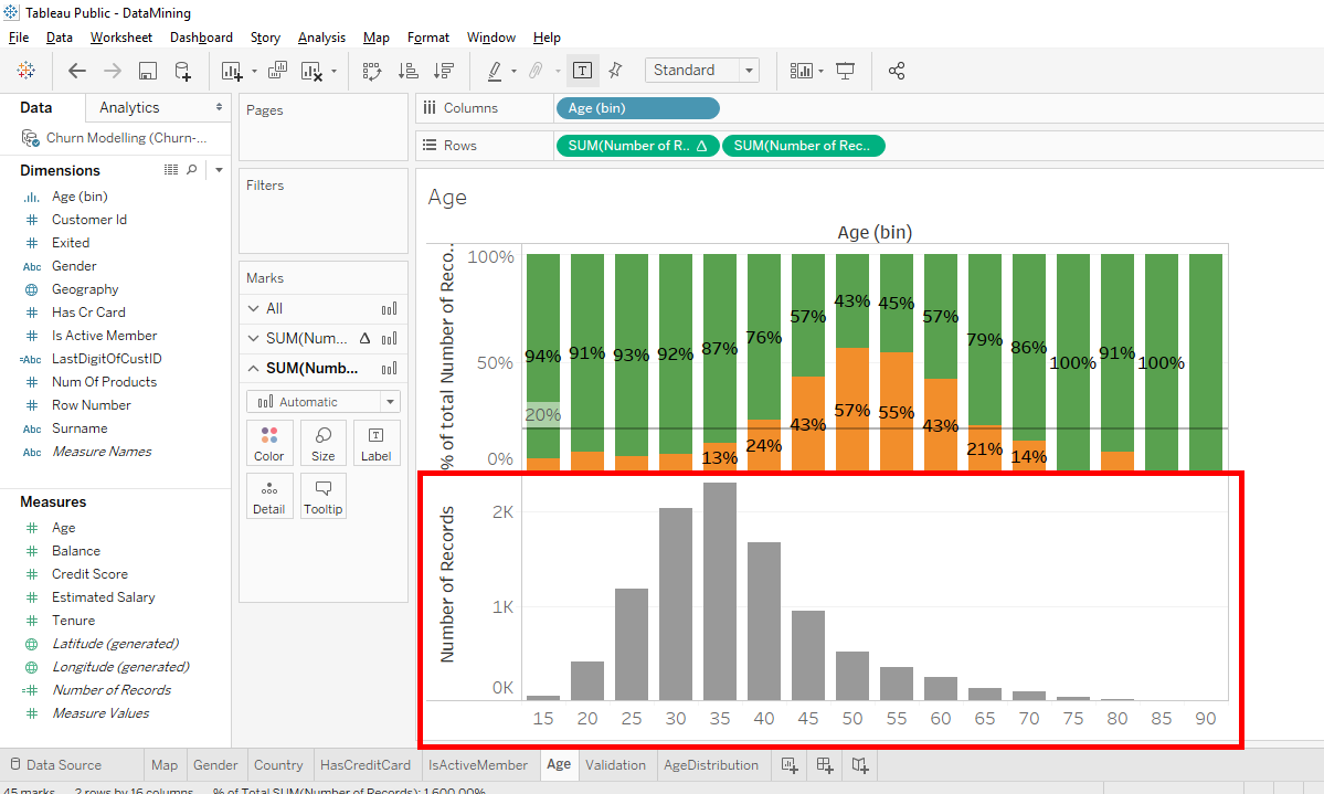
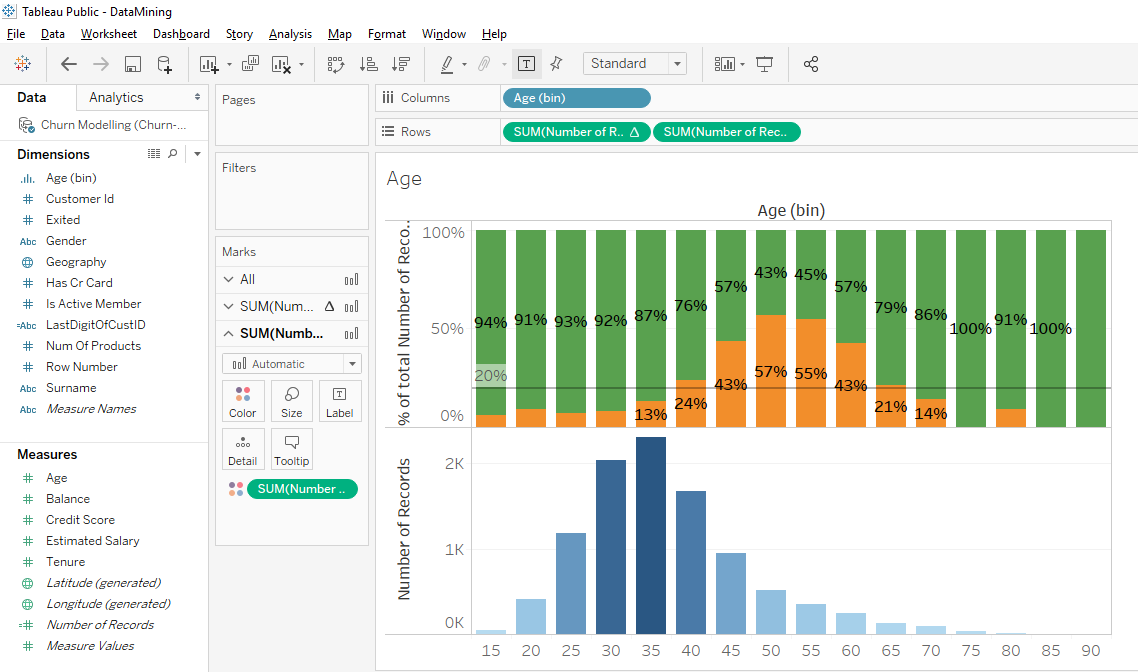
We’ll move to the next level. We’ll work with 2 bar charts in parallel to have a more efficient data mining. In a previous article, we created 2 different bar charts. The 1st was an A/B test (actually, it’s a classification test) that told us in which age range the clients were most likely to leave the bank. The 2nd was a bar chart showing the age distribution of clients in our sample of 10 000 clients.
Let’s go. We’re going to have an A/B test with age range and we’ll add a bar chart of the client distribution below. To add a bar chart, we must start by choosing what we want to keep and what we want to add. In our case, we want to keep the columns because they’re the same in the 2 bar charts.

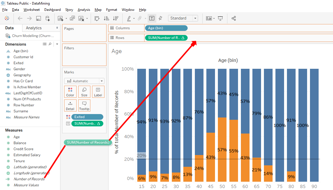
And we just want to add a new line so we will add a new variable in « Rows ». As we want to add a bar chart of distribution, we will use the variable which corresponds to the number of observation « Number of Records ».
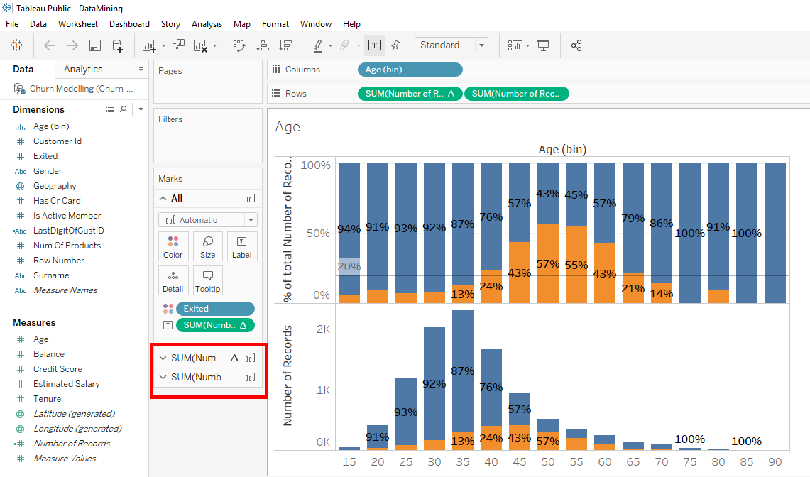
In « Measures » moves the variable « Number of Records » in « Rows » to the right of « SUM(Number of Records).
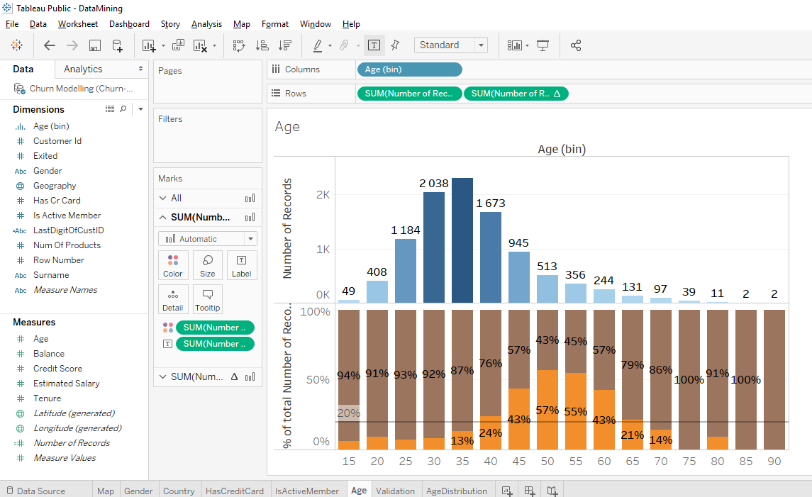
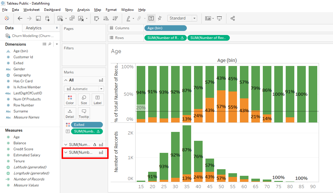
We have a 2nd bar chart below the 1st bar chart. As you can see, these 2 bar charts are in one column. « Columns » is « Age(bins) ». These 2 bar charts are in 2 different lines which are the lines that correspond to the 2 « SUM(Number of Records) » in « Rows ».
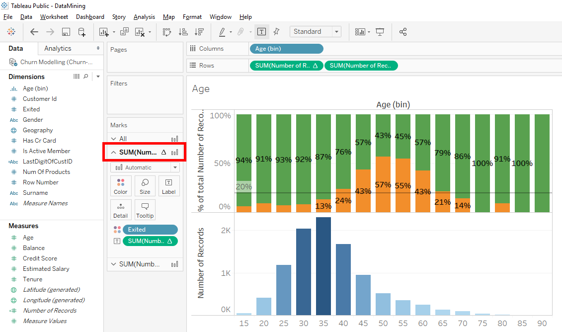
The space on the left has also changed. There is « All » which represents the 2 bar charts at the same time. It means, when your select « All », you make change in the 2 bar charts.
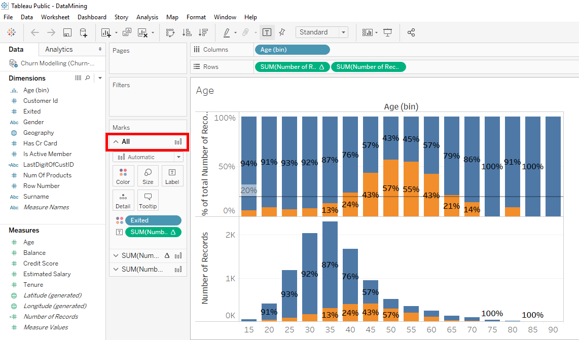
Below this tab « All » we have 2 tabs. The 1st tab represents the 1st bar chart so the 1st « SUM(Number of Records) » in « Rows » and the 2nd tab represents the 2nd bar chart so the 2nd « SUM(Number of Records) » in « Rows ».
Which means that if you want to make changes on the 2 bar charts at the same time, you make the changes in the tab « All ». If you want to make changes only in the first bar chart, you select the first tab below « All ». If you want to make changes only in the 2nd bar chart, you select the second tab below « All ».
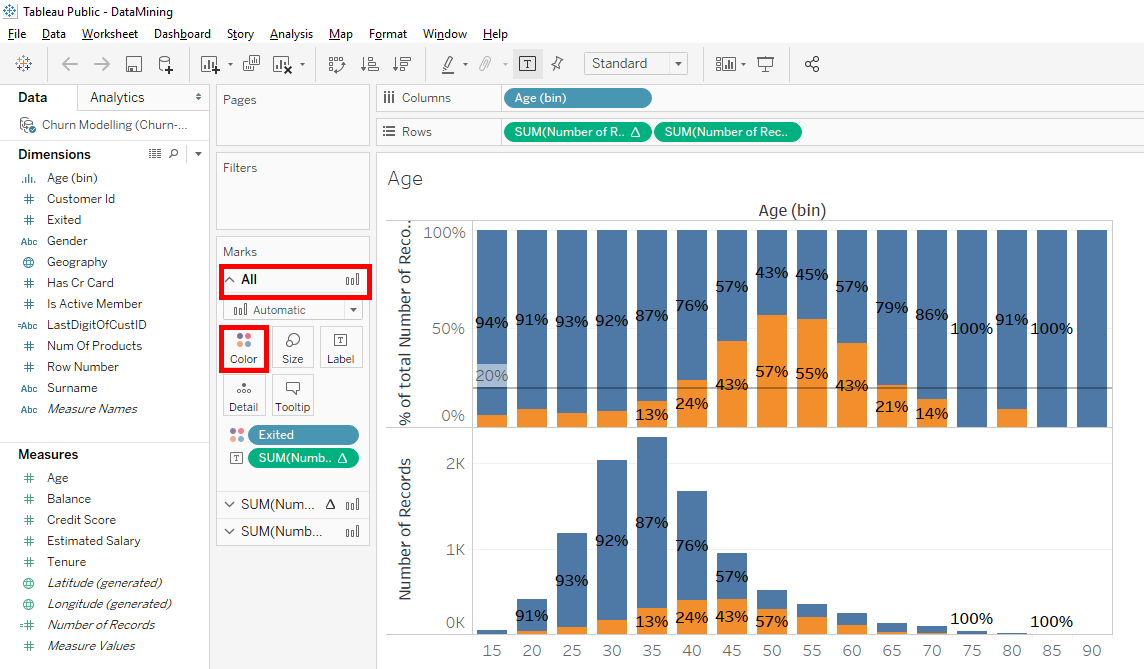
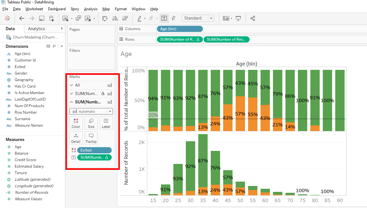
So if you change the color in tab « All », our 2 bar charts will be colored by the same color.
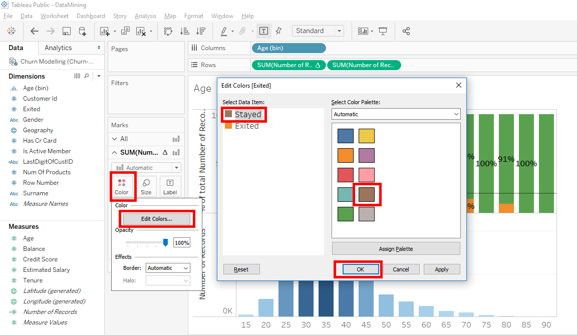
Select the « All » tab and click on « Colors ».
Click on « Edit Colors… » and select « Stayed ». Select the green color and click on the « OK » button.
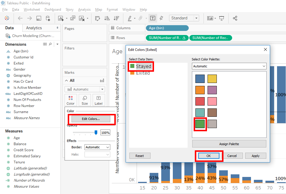
As you can see, the color changed in the 2 bar charts.

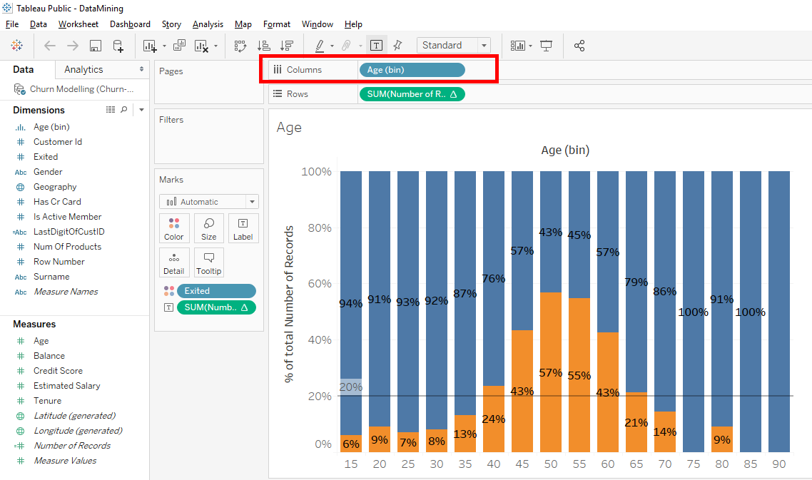
Click on the tab of the 2nd bar chart.
Removes the « Exited » variable from « Colors » to remove colors only in the 2nd bar chart.
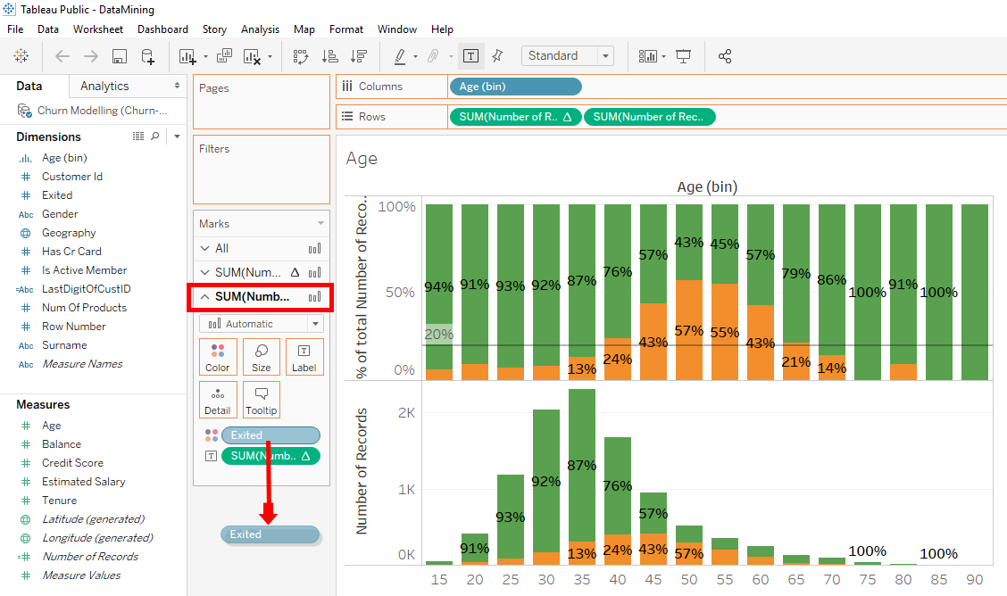

Removes the « SUM(Number of Records) » variable from « Label » to remove the labels only in the 2nd bar chart.
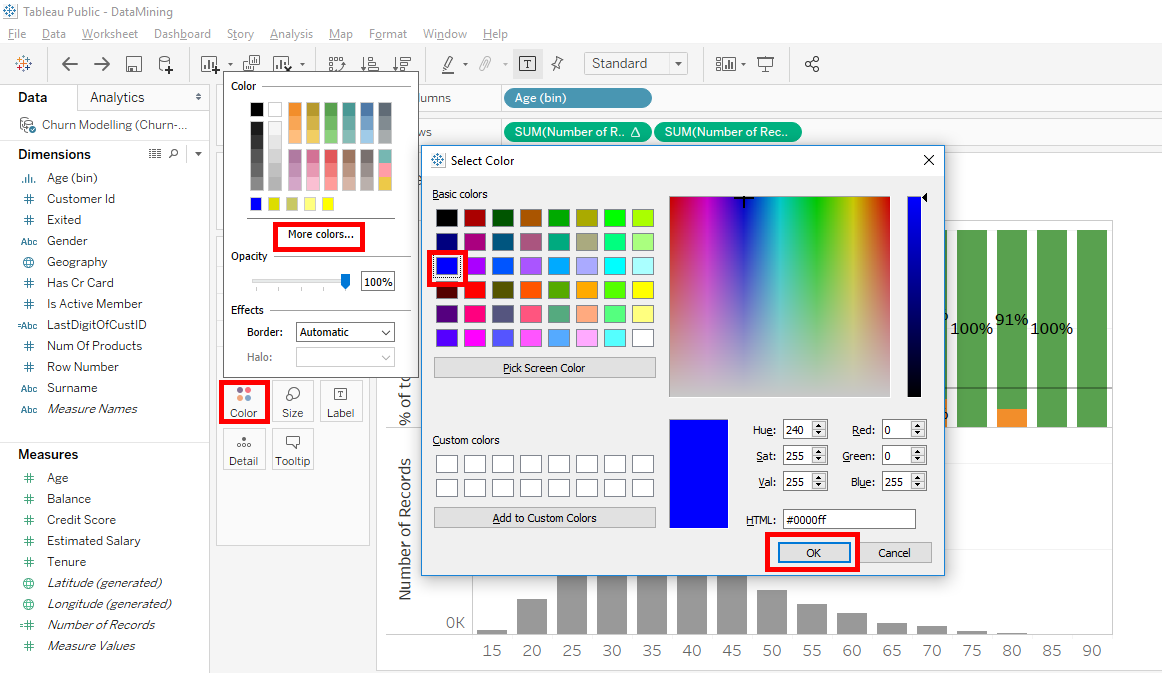
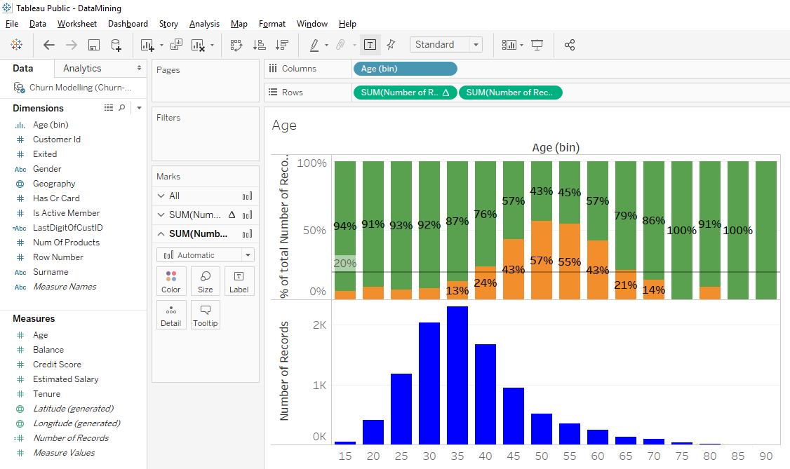
We will add color on this 2nd bar chart. Click on « Colors », click on « More colors… » and select the blue color. Click on the « OK » button.
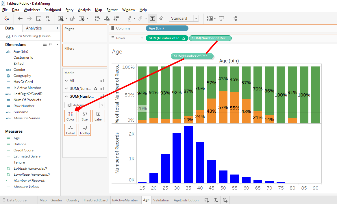
Now, we would like to see the colors vary in intensity depending on the number of observations. Take « SUM(Number of Records) » from the 2nd line in « Rows » and holding « Ctrl » or « Command », move it to « Colors ».
Cool ! We will take care of the 1st bar chart. Select the tab of the 1st bar chart.
Click on « Colors ». Click on « Edit Colors… ». Select « Stayed ». Select the brown color and click on the « OK » button.

For more clarity, we will add labels in 2nd bar chart. Click on the tab of the 2nd bar chart. Take « SUM(Number of Records) » from « Colors » and holding « Ctrl » or « Command » and move it to « Labels ».

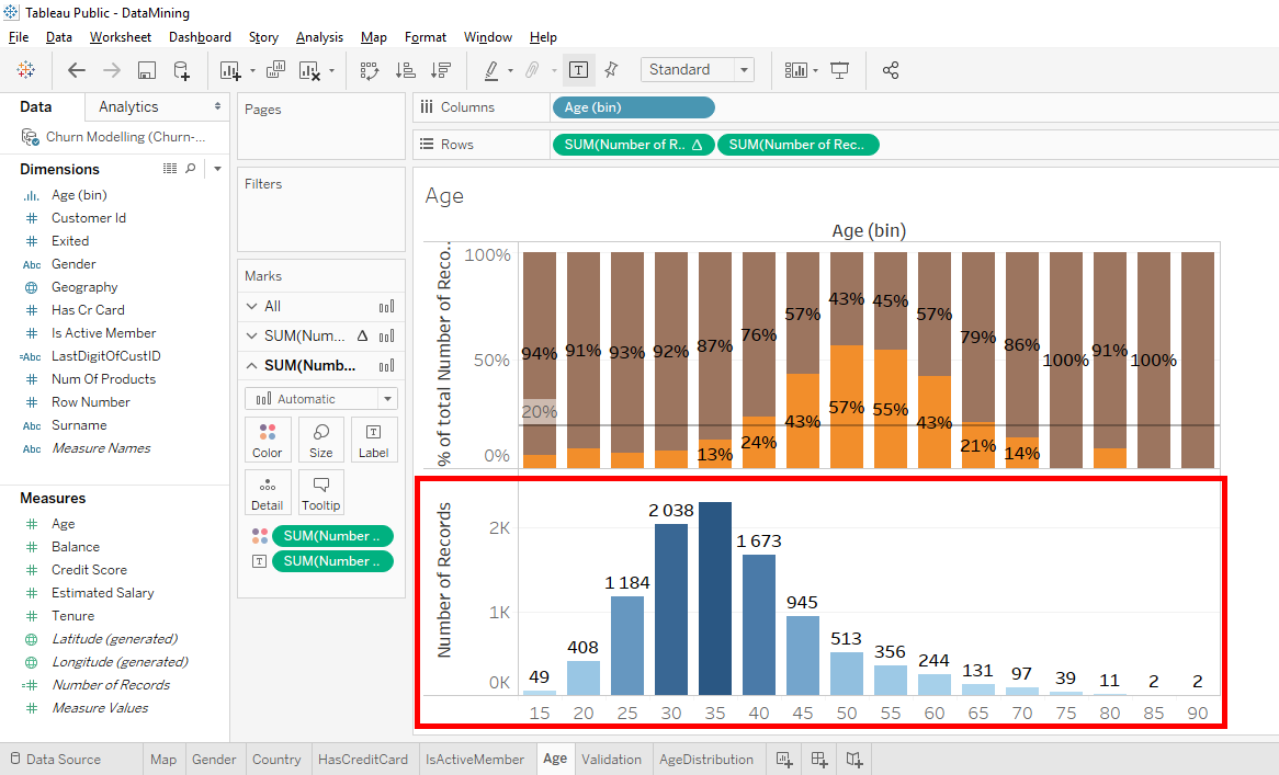
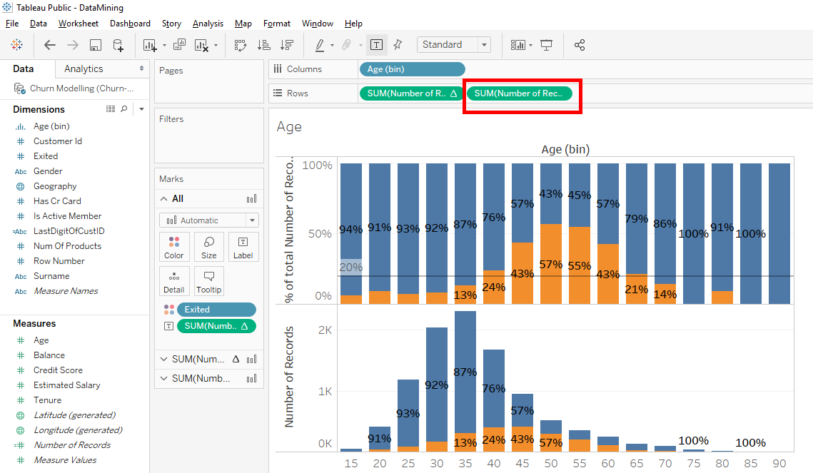
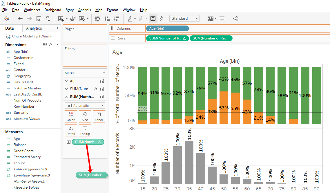
Perfect. Now we will change the location of the bar chart. We will put the 2nd bar chart instead of the 1st bar chart. According to the logic of « Rows » and « Columns », simply put the 2nd line « SUM(Number of Records) » to the left to pass in 1st line.
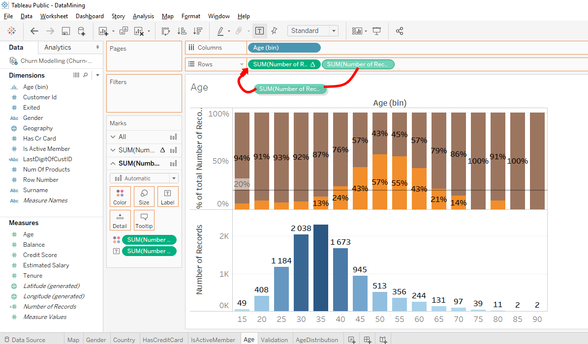
BOOM, the bar chart of the age distribution is going over because it’s in the 1st line in « Rows ». With these changes, tabs to change the bar charts have changed order.
Observation
What we can observe with these bar chart is that we see on the 1st bar chart that the majority of bank’s clients are in the age group of 30 to 34 years old and 35 to 39 years old. In these 2 age groups, we see on the 2nd bar chart that client of 30 to 34 years old are less likely to leave the bank than clients between 35 and 39 years old. Look at ages 30 to 34, the rate of clients leaving the bank is 8% while in the 35 to 39 age group, the number of clients leaving the bank is 13%.
In the age group of 40 to 54 years old, we see on the 2nd bar chart that the rate of clients leaving the bank is increasing and is above of the average rate of clients leaving the bank (20%). But we see in the 1st bar chart that the number of clients in the age group of 40 to 54 years old decrease with the age groups.
Do you remember the potential for anomalies in age groups 75, 85 and 90 ? We’ll check it. In the 1st bar chart we can see that there are 11 clients in the age group of 80 to 84 years old, 2 clients in the age group of 85 to 89 years old and 2 clients in the age group of 90 to 94 years old. We can conclude that these observations in age group of 80, 85 and 90 aren’t very significant from a statistical point of view because 2 clients is something negligible in this sample of 10 000 clients.
In the first age group of 15 to 19 years old, we can see that there are 49 clients, which is not very significant.
Compare these 2 bar chart in parallel allows us to have additional insights.
Subscribe to my newsletter and share this article if you think it can help someone you know. Thank you.
-Steph