
I have just enrolled in a Data Science course on Udemy and I learned good stuff.
It’s cool, you finished the 1st part. Now we’re going to do more deep Data Mining analysis with this bank’s dataset.

To make these analyzes more deep, we’ll create a more statistical approach.
To do that we will create a new tab.
For this new tab, we want to understand how client distributed according to their age. Is there a majority of young or old people ?
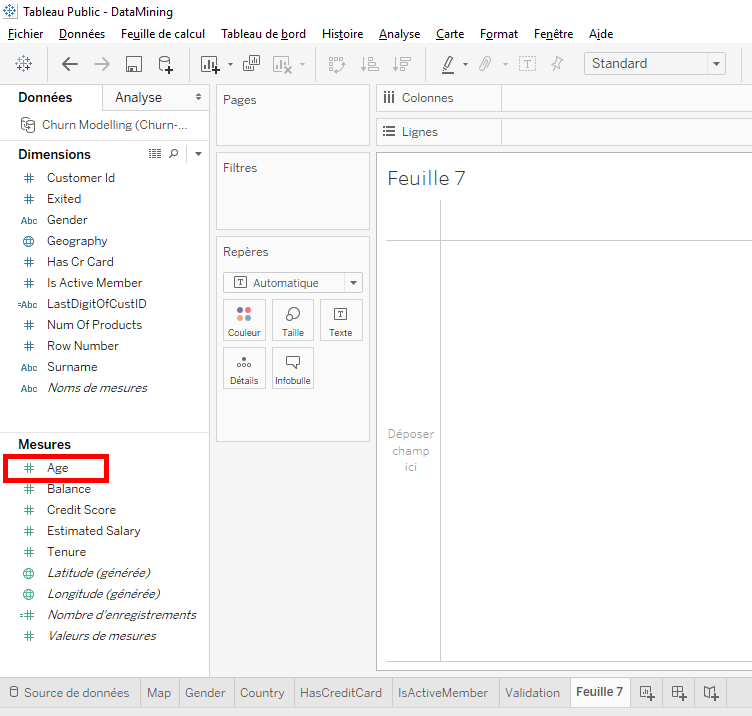
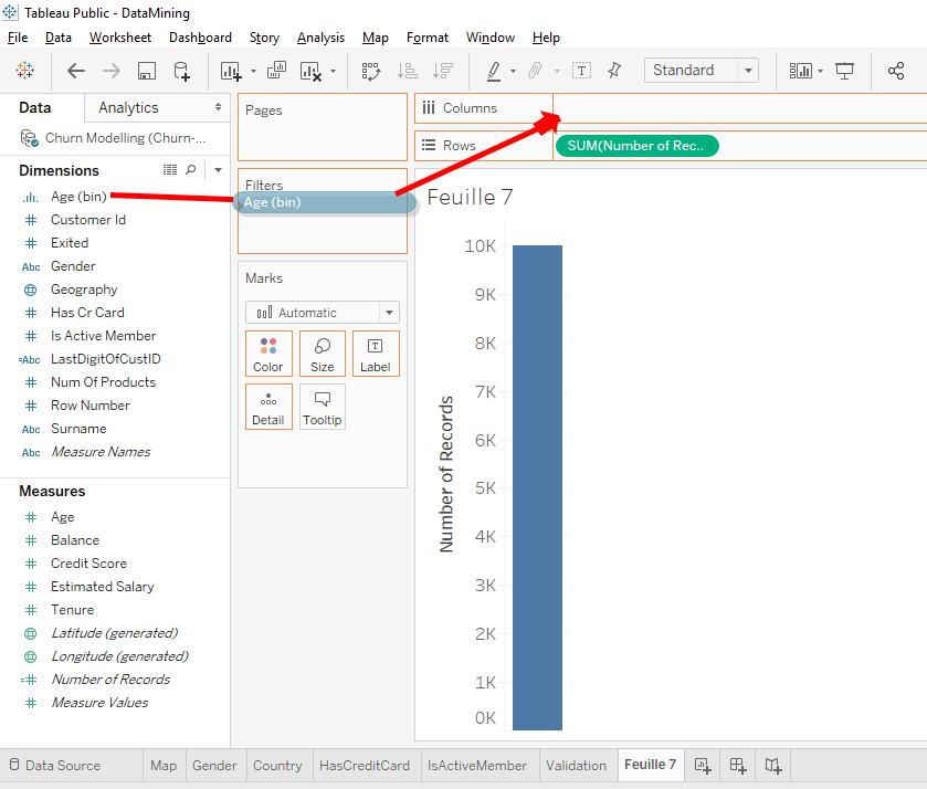
Move the variable « Age » in « Columns ».
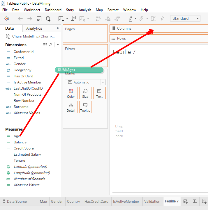
As we want to see the distribution of client ages, we need to use the variable « Number of Records » to see the number of observations. Move the variable « Number of Record » to « Rows ».

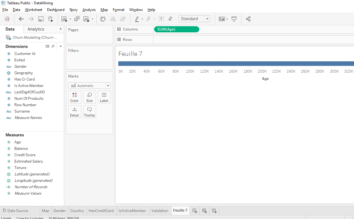
Boom, we have a chart but there is only one point on the top right. What happened is that Tableau took the sum of the ages of all the bank’s clients and the sum of all the « Number of Records », it means the total number of clients, 10 000 clients.
We’ll find a solution but before we’ll change the format to better see the chart. Right-click in the middle of the chart and select « Format ».
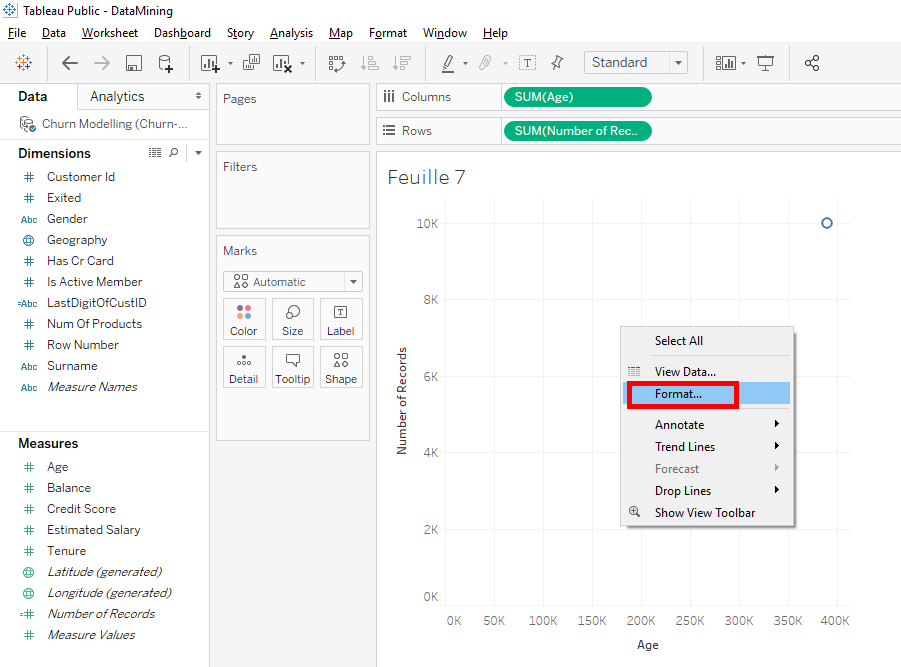
For the font’s size, select « 12 ».

Here you can see that the total age is 39 218 but that’s not what we’re looking for. What we want to see is the number of clients for each age.
I’ll explain what’s going on. We took the aggregated sums of our variables. Aggregate means that we took the total sum of the variable for each category. We added the ages but in fact we want to see the total number of observations for each age separately.
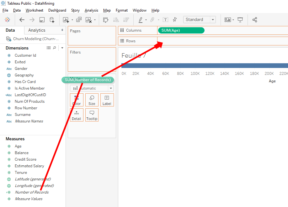
To have that, just click on the arrow in « SUM(Age) » in « Columns ».
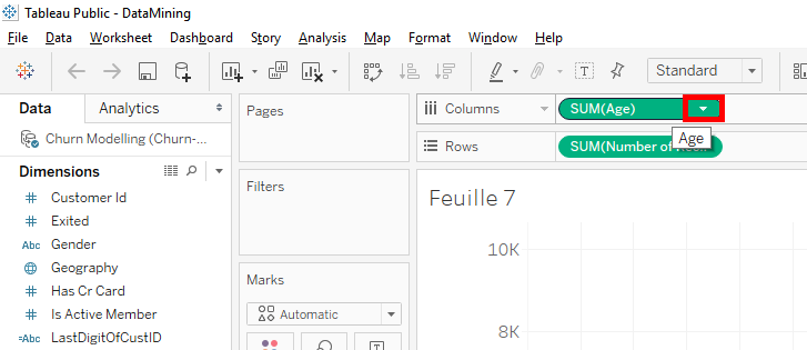
Then select « Dimensions »
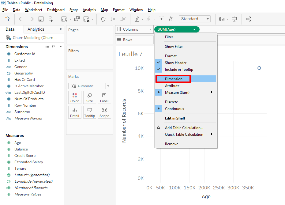

You see, Tableau doesn’t take the aggregated sum of ages but it takes ages separately. We have a curve that shows us the continuous distribution of our clients ages. That is to say, for each age, the curve gives is the number of clients of this age.
We’ll look at the dataset. Right-click on « Churn Modelling » and select « View Data… ».
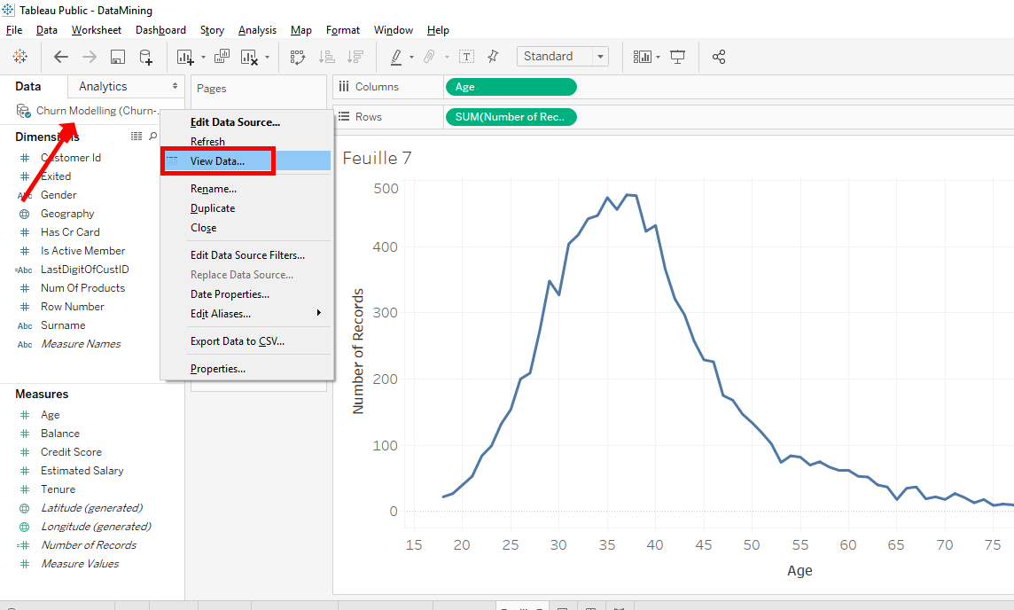

There is window that appears that shows us the data in detail. If you scroll to the right, you will find the column « Age ».
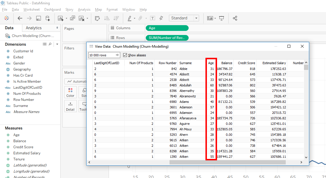
We see that the ages rounded. As all ages rounded, Tableau is able to group clients by age. By positioning the mouse on the curve, we can see that there are 200 clients who are 26 years old.
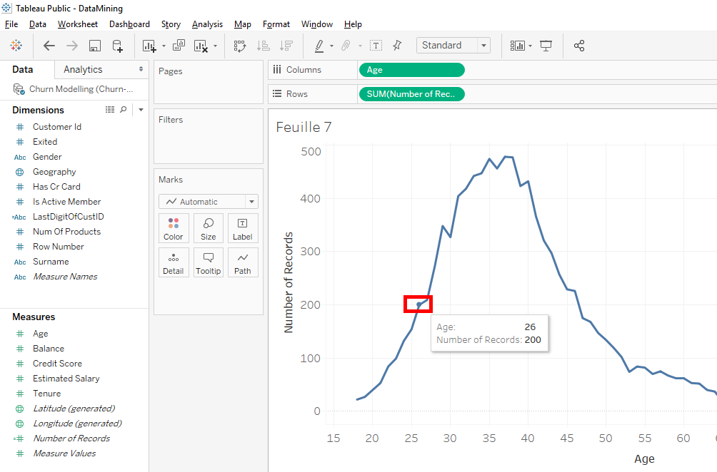
If in the dataset, ages weren’t rounded, you would have seen clients with 26.5 or 26.3 years. It would create a lot of irregularity, there would be plenty of spikes with lots of variations.
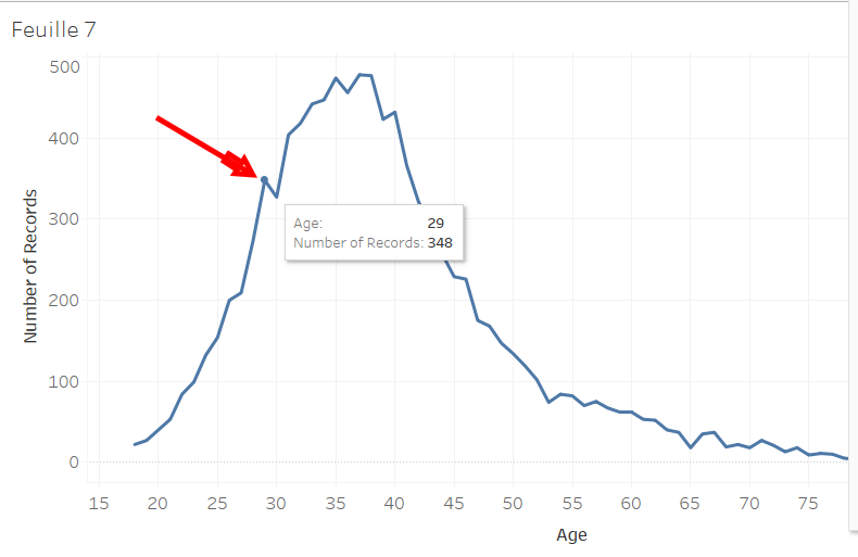
Oooooh look, there is a variation that isn’t normal.

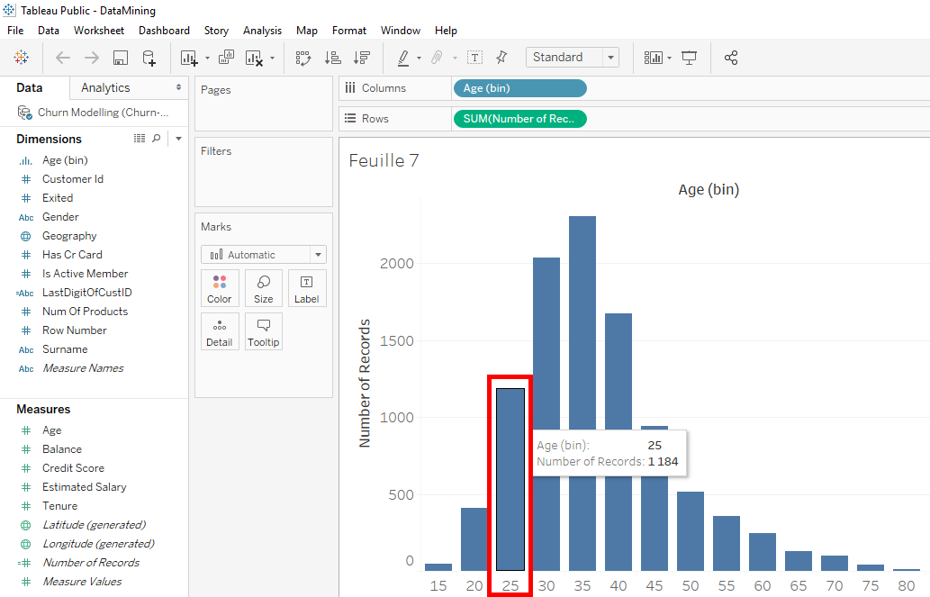
Let’s analyze it in detail. Around this peak, we see that there are 348 clients who are 29 years old.
Here, 404 clients who are 31 years old.

And this peak down that shows us that there are 327 clients who are 30 years old.
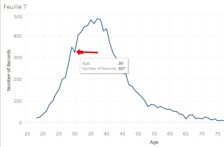
How to explain this irregularity ? It’s possible that many people of 29 years old are about to turn 30 years old and many people of 31 years old who just had 31 years old. It’s chance that make us have inaccuracies. You may have other inaccuracies if you data isn’t precise and rounded. In our case, the ages are rounded but we want to get rid of our small irregularity that we see on our curve.
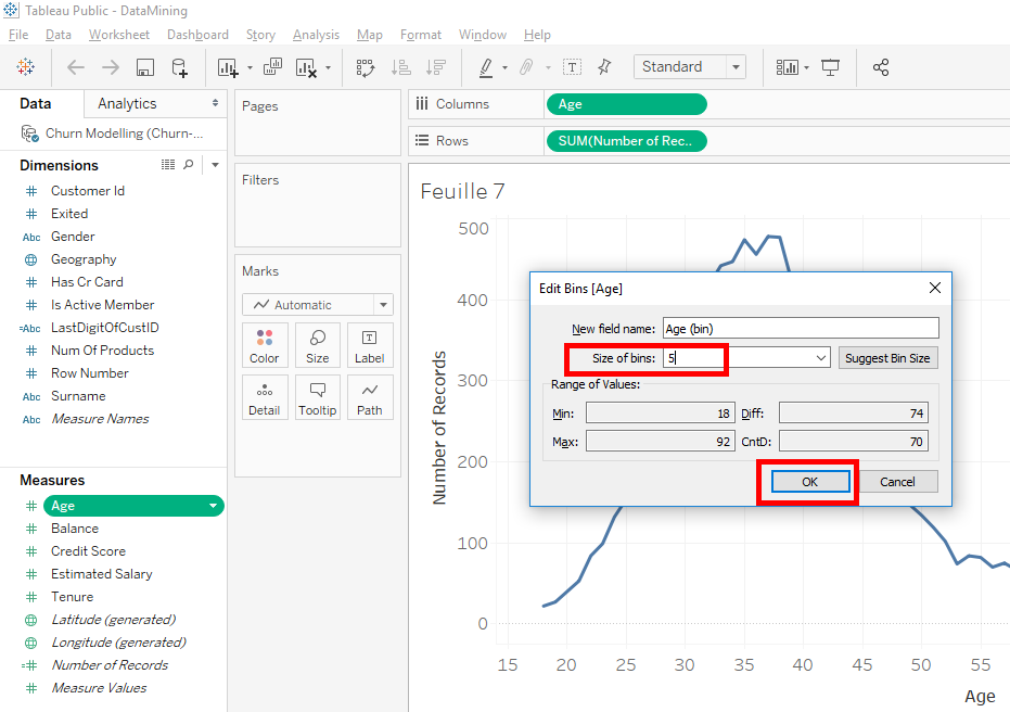
There is way to see our distribution without our irregularities, it’s « bins ». « Bins » consists of grouping the information into different categories. That is we’re going to regroup our clients in different age groups.
Right-click on « Age » in « Measures ». Select « Create » and select « Bins… ».
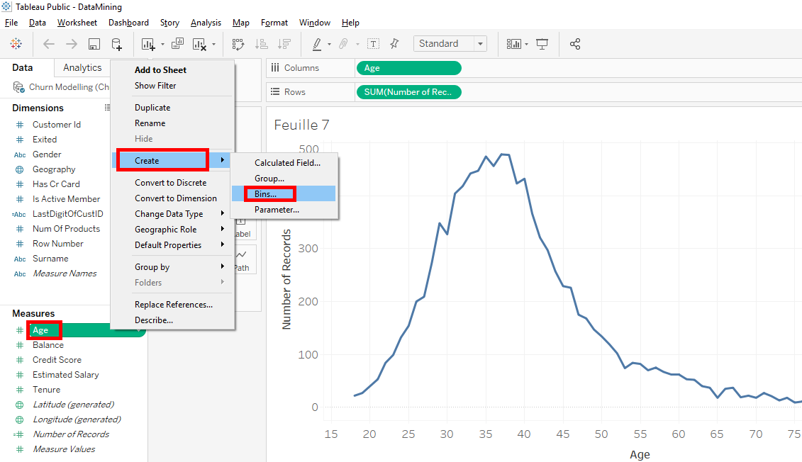
A window appears. We’ll group our clients in 5-years increments. In « Size of bins », write « 5 » and click on the « OK » button.
As you can see, the variable « Age » has remained in « Measures » but there is a new variable in « Dimensions ».This is the variable we created « Age(bins) ».
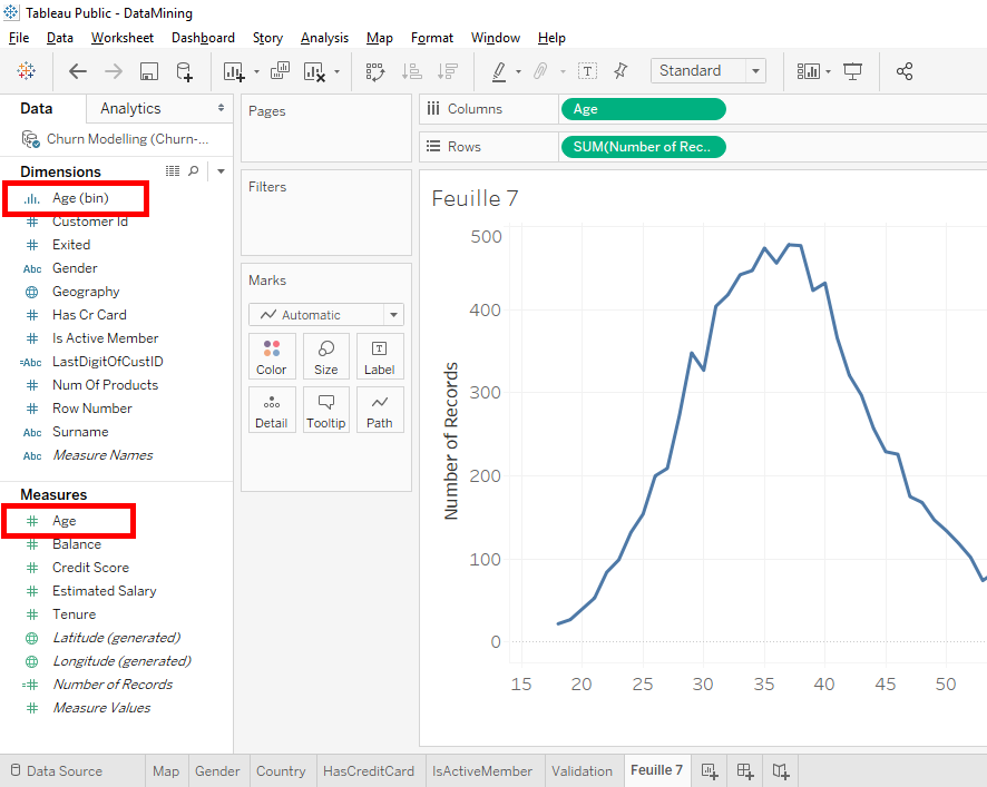
Our « Age(bins) » variable was correctly placed in « Dimensions » because it is a category variable because each category corresponds to a 5-year age group.
For example, one category is 20 to 24 age group. Now we’ll create a new distribution based on « bins ».
To do that, we’ll remove the variable « Age » from « Columns » with a click and drag outside.
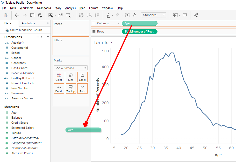
You move the variable « Age(bins) » from « Dimensions » to « Columns ».
Note
In this case, it’s not possible to directly replace « Age » by « Age(bins) » over « Age » on « Columns ». This is because « Age » is a measure and « Age(bins) is a dimension.
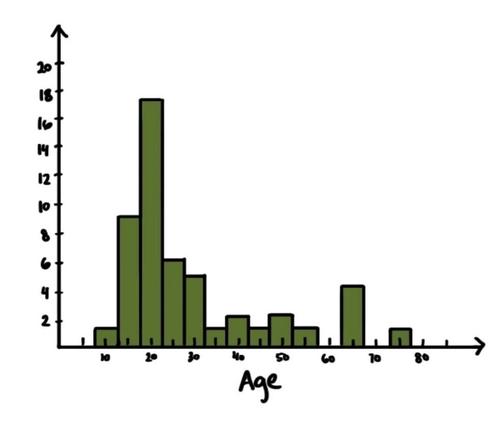
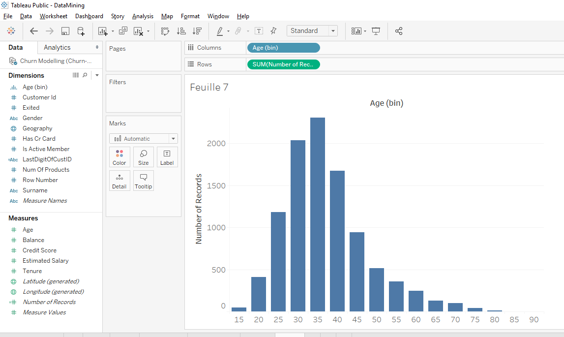
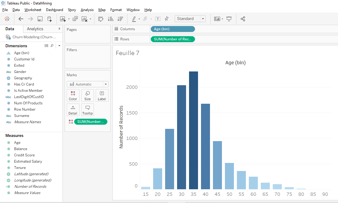
That’s nice distribution, it’s usually the type of distribution (chart) we see in economics or mathematics. The difference with the old chart is that this chart is discrete. This chart is discrete because the clients grouped by age group while the previous chart was continuous.
On this distribution (chart), each bar corresponds to an age range. For example, this bar corresponds to the 25-29 age group.
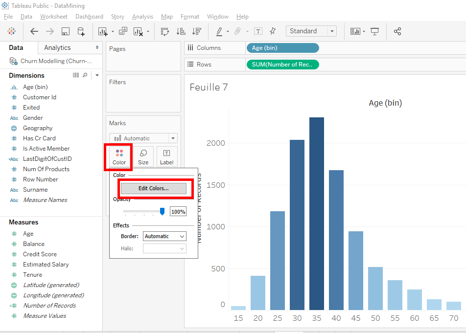
Now, we’ll change the colors.
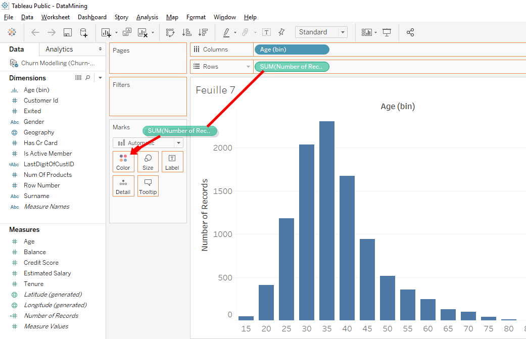
In « Row », move « SUM(Number of Record) » while holding down the « Ctrl » or « Command » key on your keyboard to « Colors ».
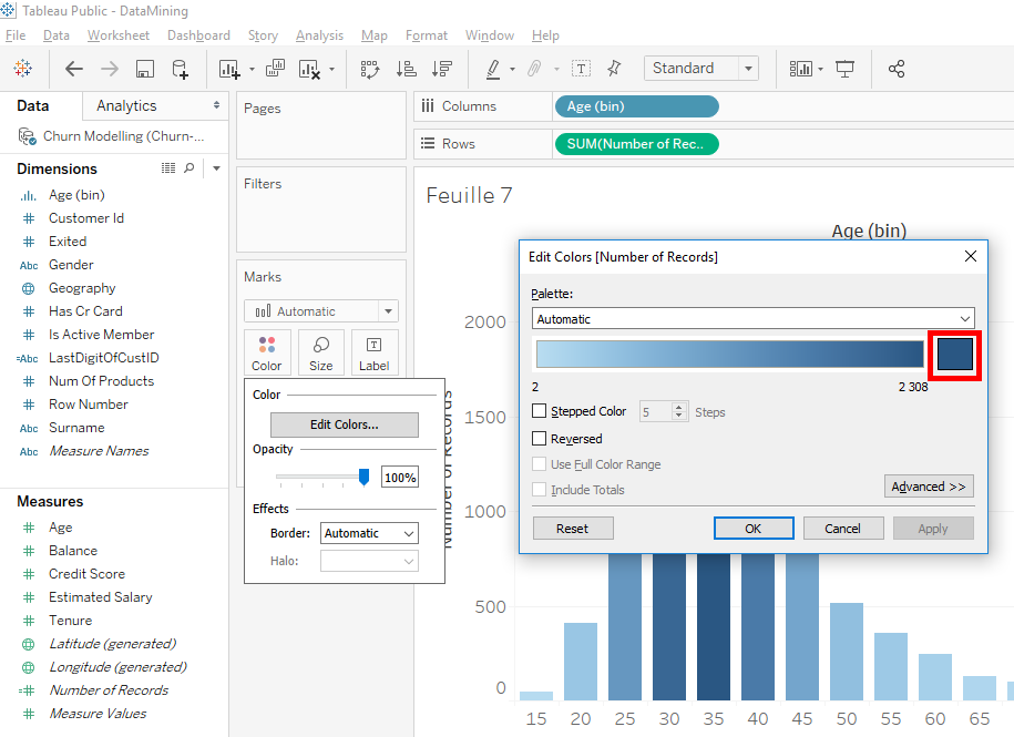
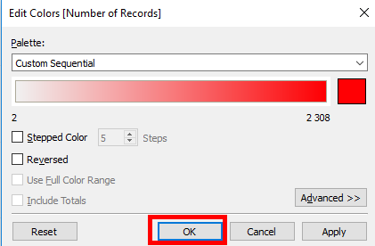
We get our distribution in blue but we’ll change the color to red. Click on « Colors » and click on « Edit Colors »
In the window that appears, click on the blue square on the right to display the color pallet.
Select the red color and click on the « OK » button.
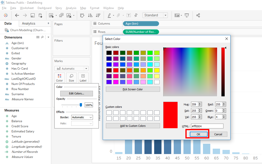
Click on the « OK » button of the « Edit Colors » window.
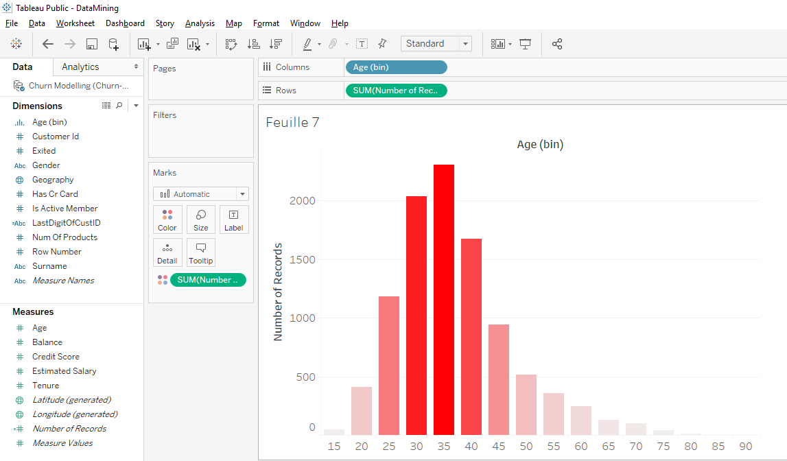
To facilitate the reading of the bar chart, we’ll add the number of clients in each age group. In « Row », move « SUM (Number of Record) » while holding the « Ctrl » or « Command » key on your keyboard to « Label ».

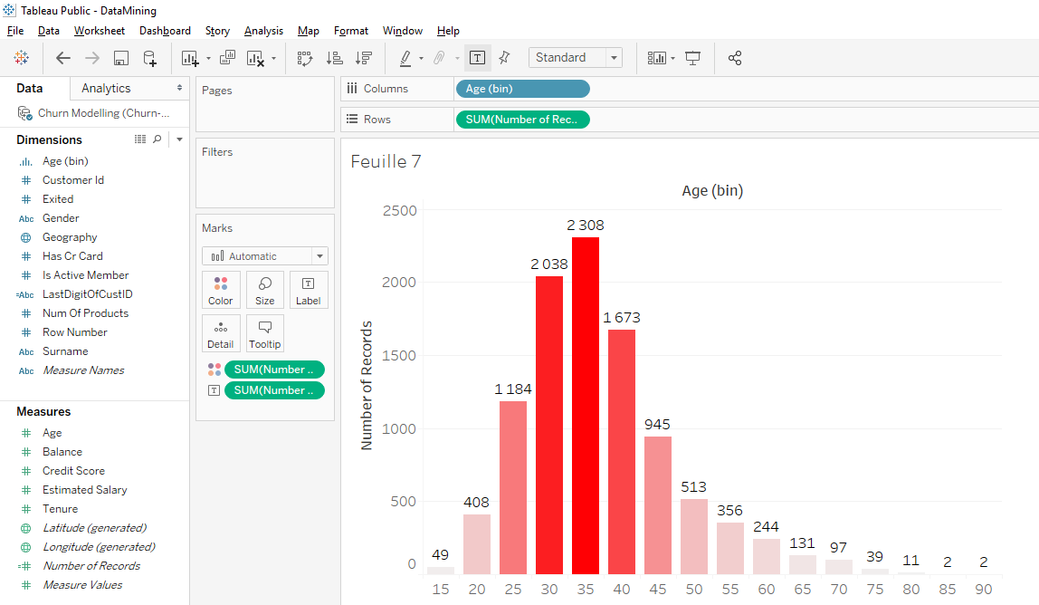
That’s it, we can see how many clients there are in each age group.
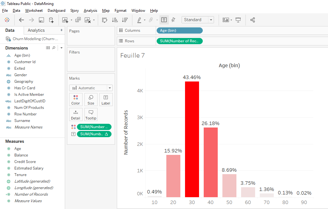
We see that the dominant bar is the 35-39 age bracket and the second dominant bar is the 30-34 age bracket. Overall, we can see that most clients are between 25 and 40 years old, which seems consistent.
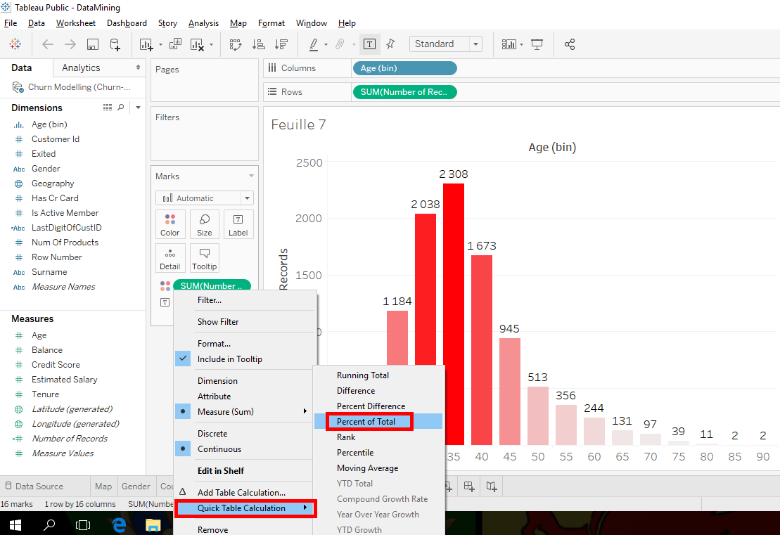
On our bar chart, we have absolute values. We’ll replace that with percentages. Click in the little arrow in « SUM(Number of Records) » in « Label » and you select « Add Table Calculation… » but I’ll show you another way to do it.
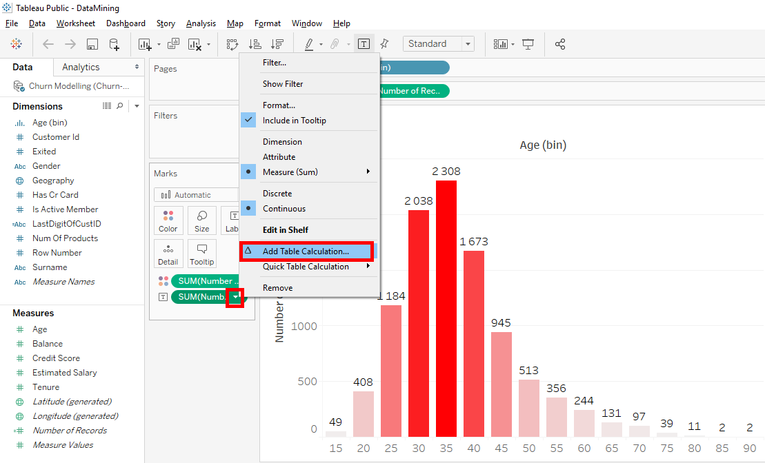
Instead of clicking « Add Table Calculation… », click on « Quick Table Calculation » and select « Percent of total ».
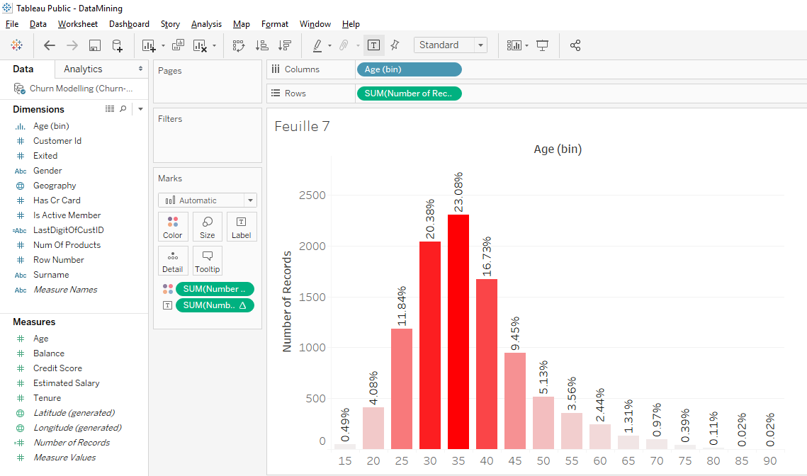
It’s cool, we have the exact percentage of people in each age bracket. Now, we can see that in the 25 to 40 age group, we have 20 + 23 +17= 60% of clients.
I’ll show you one last thing.You can change the size of the slices easily, just click on « Age(bins) » and select « Edit ».
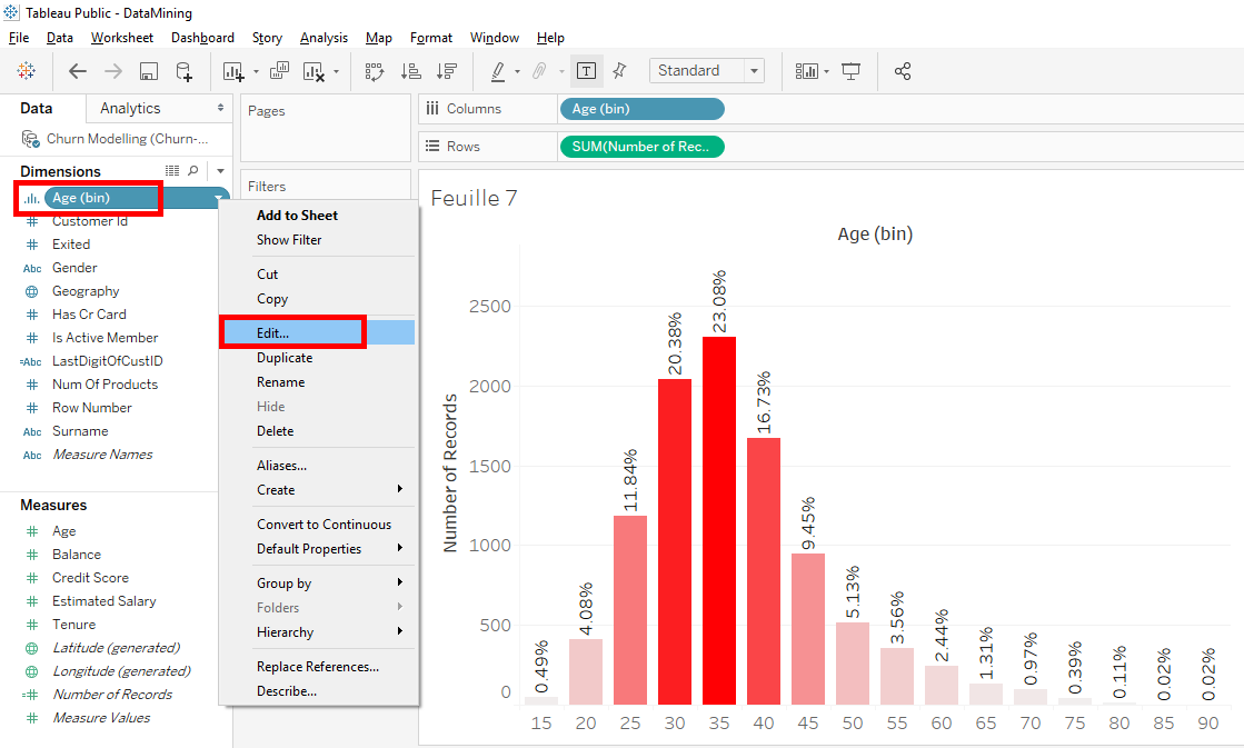
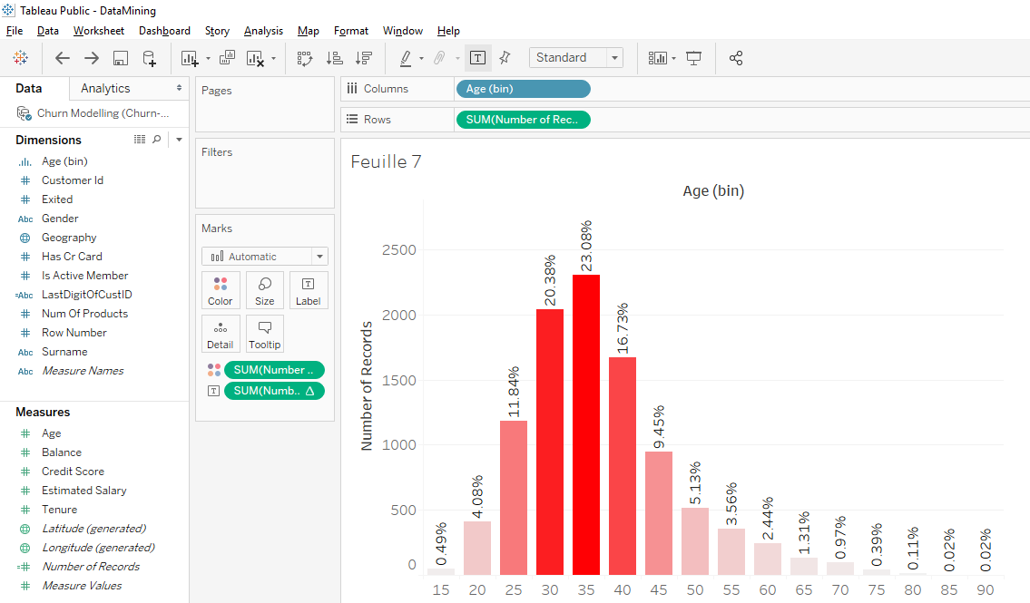
In the windows, you can change the size of the slices (bins). Put « 10 » instead of « 5 » to get 10-years slices. Click on the « OK » button.
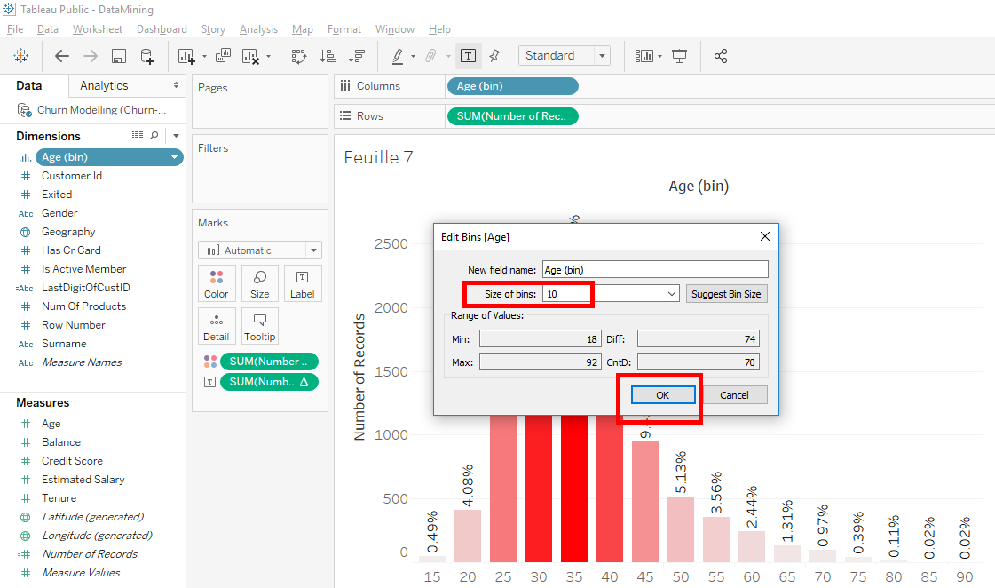
Now, we have a distibution with fewer slices and the dominant slice is 30 to 39 years old.
Well, it was just to show you how to change the size of bins. To go back to the old distribution with the 5-years slices, click on « Back » button.
As you can see, the values on bars are in percentages but the values on the axis are in absolutes values. Here is an exercise that I ask you to do : « Put the values of the axis in percentage ». I’ll give you the answer the next article.
Share this article if you think if can help someone you know.Thank you.
-Steph
You really worked hard to show the data.
It’s true, thank you 🙂
Hi Steph,
Thanks for sharing such an informative and detailed article.
It is really helpful for someone seeking guidance.
Hello !! Thank for your comment 🙂