

I have just enrolled in a Data Science course on Udemy and I learned good stuff.
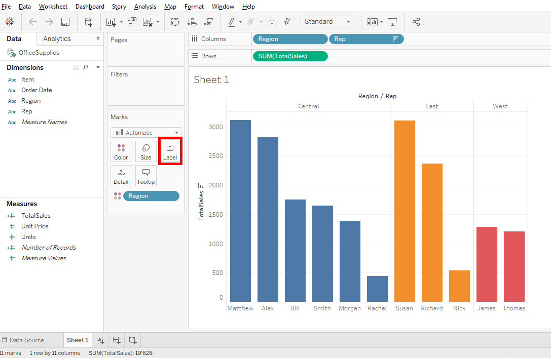
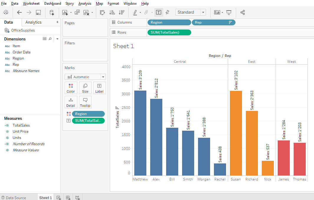
Our bar chart has colors by region but imagines that this bar chart is on a wall of an open space or in a report.
With labels, we can make this bar chart more clear, easier to understand.
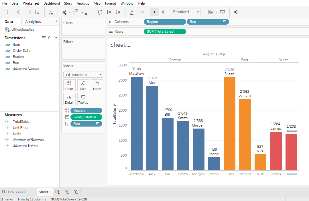
In this bar chart, there are all necessary information: representative’s names, regions where representatives make sales and total sales for each representative in Swiss francs.
But, there is a problem. For example, if you ask for someone to say how many sales made Bill. This person must find Bill and see on the vertical axis to the left the value. Here we can see, it’s 1750.
But if we take the James case, we see that it’s between 1000 and 1500. James is far from the vertical axis and it’s difficult to say the true value.
That’s means, all people need to make effort to extract the bar chart’s information.
This it should not be the case because a Data Scientist searches always the best ways to communicate the information. This process is to help people to understand and extract the information in the easiest way.
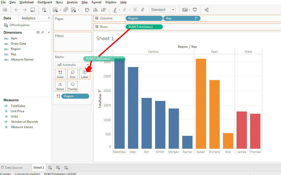
Start with labels.
« Labels » button allows you to add text information in your bar chart.
You will add a label with the SUM(TotalSales) information
To do this, you click on SUM(TotalSales) and press and maintain the key Ctrl or Command on your keyboard and drag and drop SUM(TotalSales) on « Label ».
Now you can see the total sales value at the top of each bar.
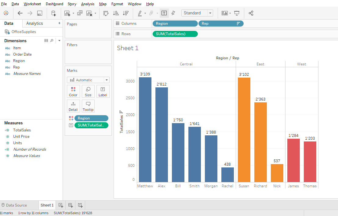
The bar chart is easier to read because there is the total value of sales for each representative.
it’s time to add more information using the labels.
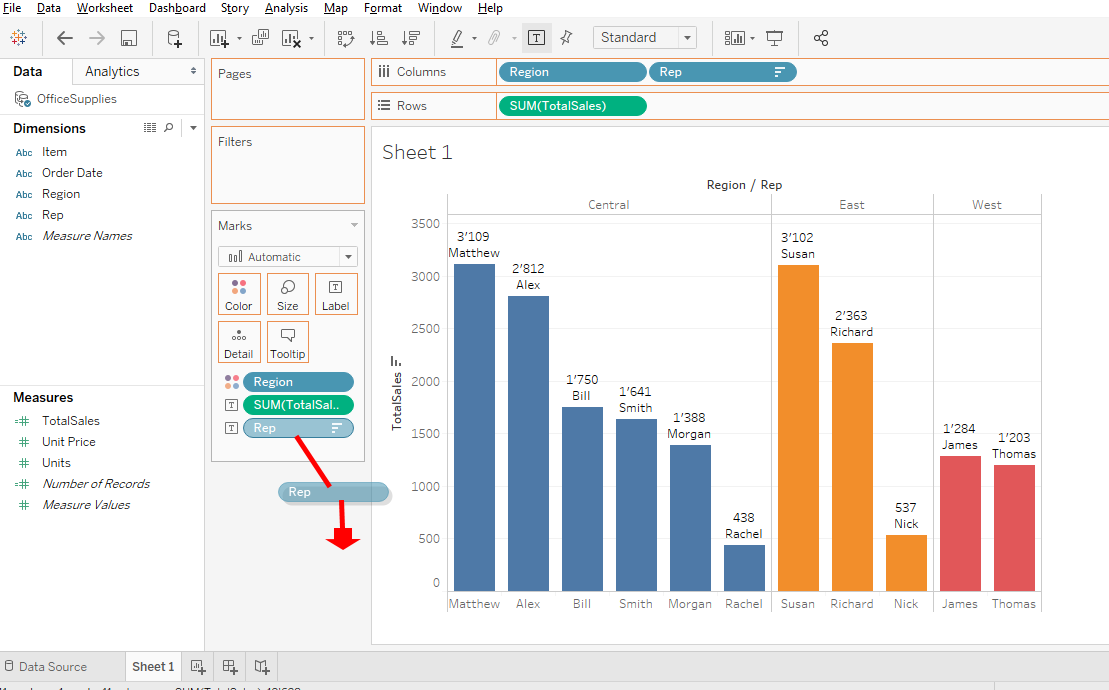
Use the « Rep » information. Click on « Rep », press and hold « Ctrl » key or Command key on your keyboard and drag and drop « Rep » to « Label ».
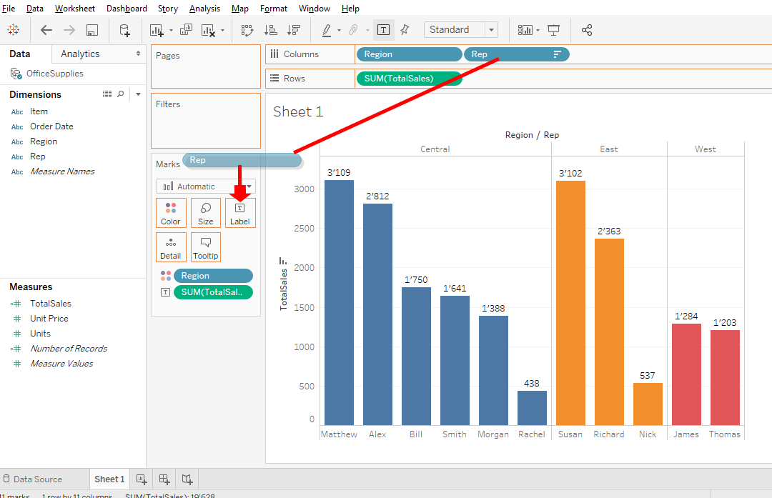
Now you can read the representatives names at the top of the bars.
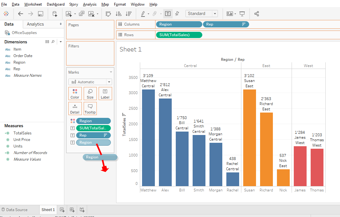
You can also add the region. I’ll show you another way to add « Region » in « Labels ». Click « Region » in « Dimensions » and drag and drop « Region » on « Labels ».

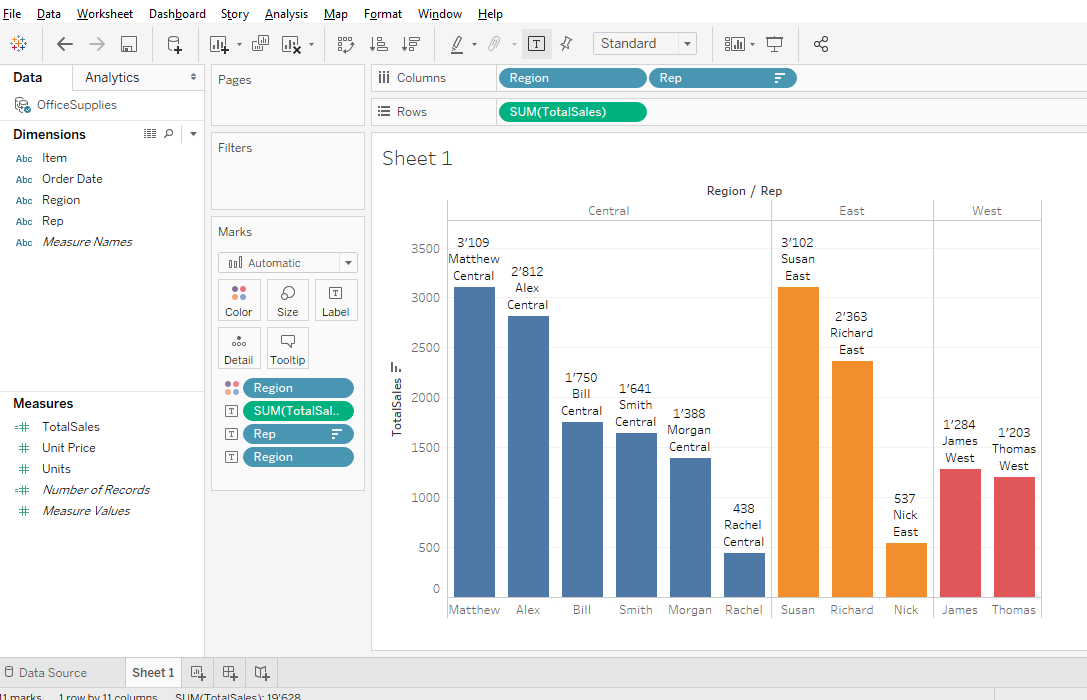
But it’s redundant because you can read the representatives names below and the regions at the top of the bar chart.
And each region has its own color. As it’s redundant, we remove « Rep » and « Region » from « Labels » by dragging and dropping out.
It’s better, it remains only SUM(TotalSales).
Let’s go to the next level, we will publish our labels.
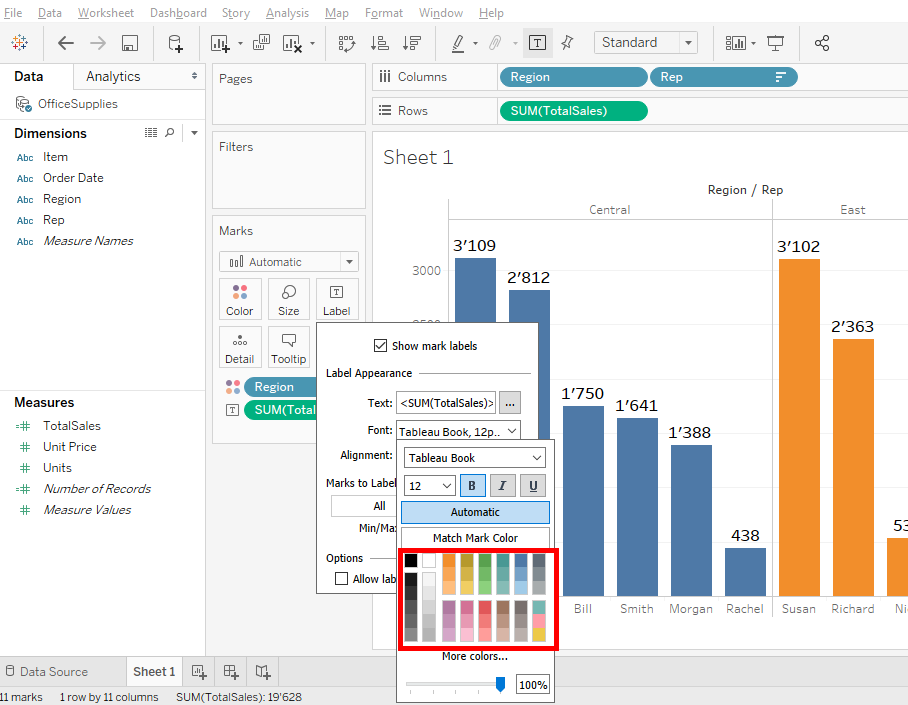
To do this, do a right-click on « Labels » and click on « … » button.

It allows you to have your own text. For example write « Sales : » and click on « OK » button.

Now you can see that your text appears at the top of the bars.
Well, click on « Labels » and click on « … » button.
Delete the text « Sale : »and click on « OK » button.

We will see now how to format your bar chart. This is the last step before your bar chart is in production.
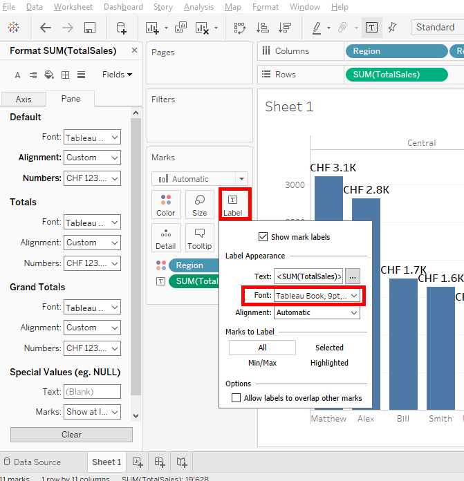
You will change the labels size. Click on « Labels » and click on « Font »
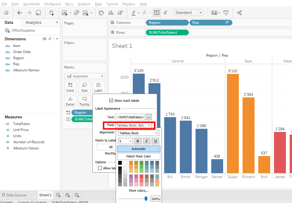
Select « 12 » and bold.
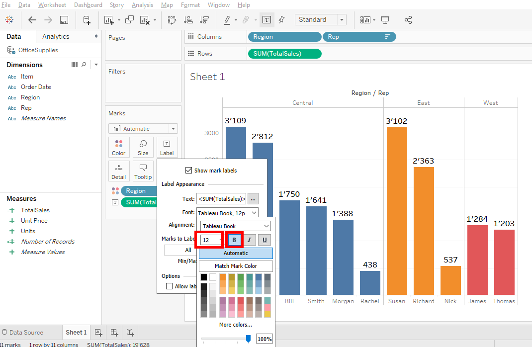
Oh, you can do the same thing by clicking on « … » button
You have the possibility to change the color but we will keep the color black
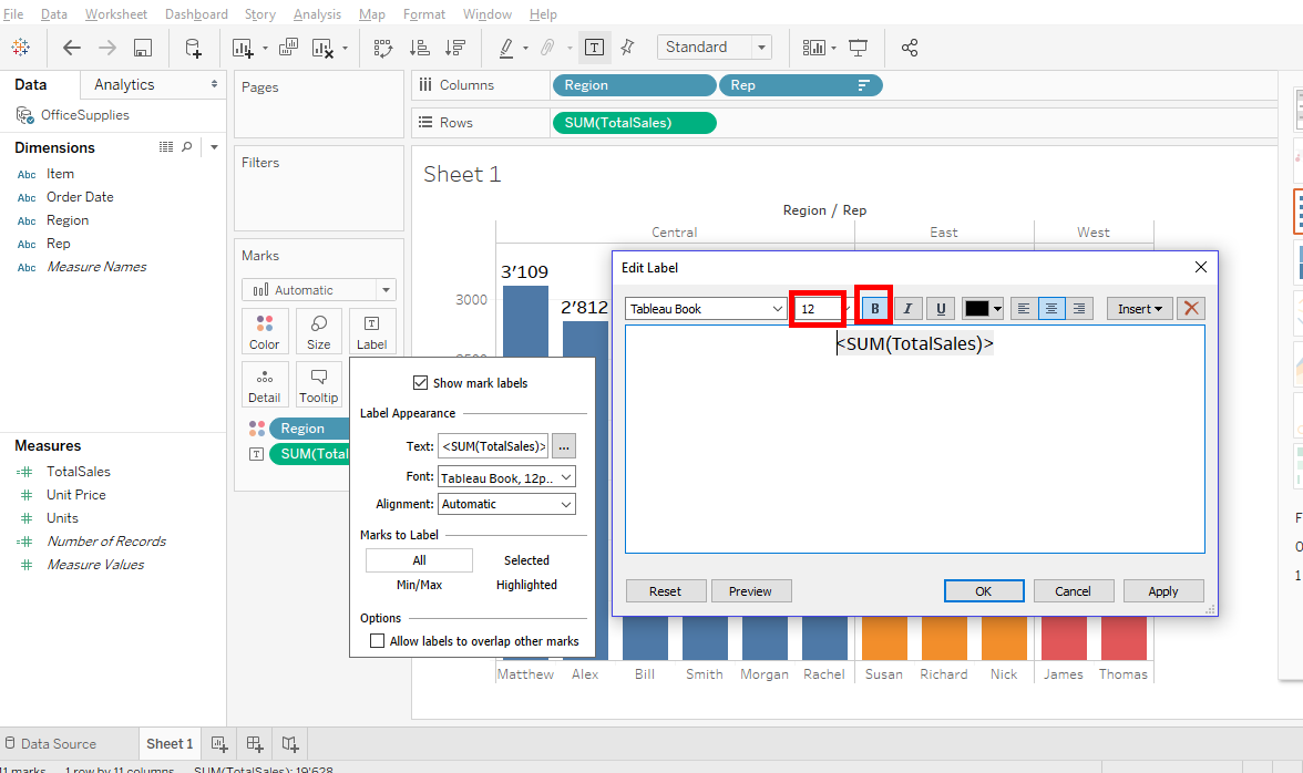
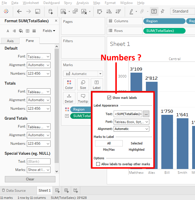
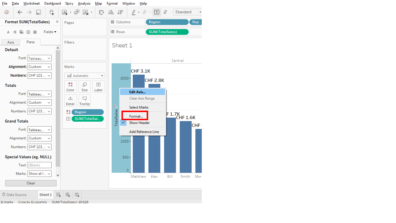
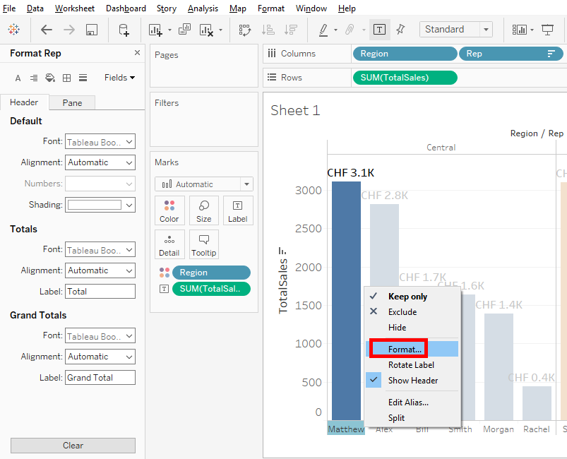
Now you’re going to change the label type. Right-click on SUM(TotalSales) and click on « Format… ».
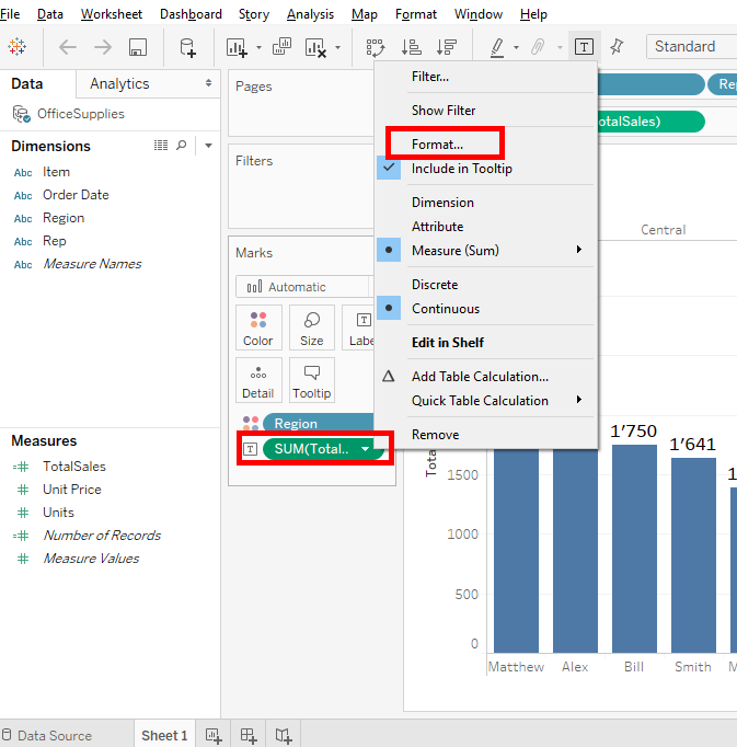
In fact the labels have their own format and you can change that by clicking on « Label » but all the other thing on Tableau give their format options make a right-click on it.
So when you click on « Format », you’ll see 2 tabs : « Axis » and « Pane ».
Select the tab « Pane » because that’s where the labels of our bar chart.
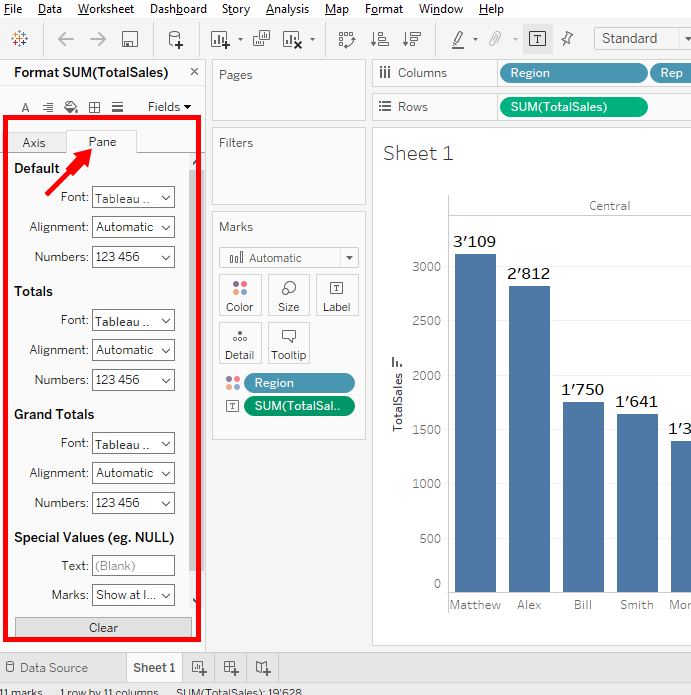
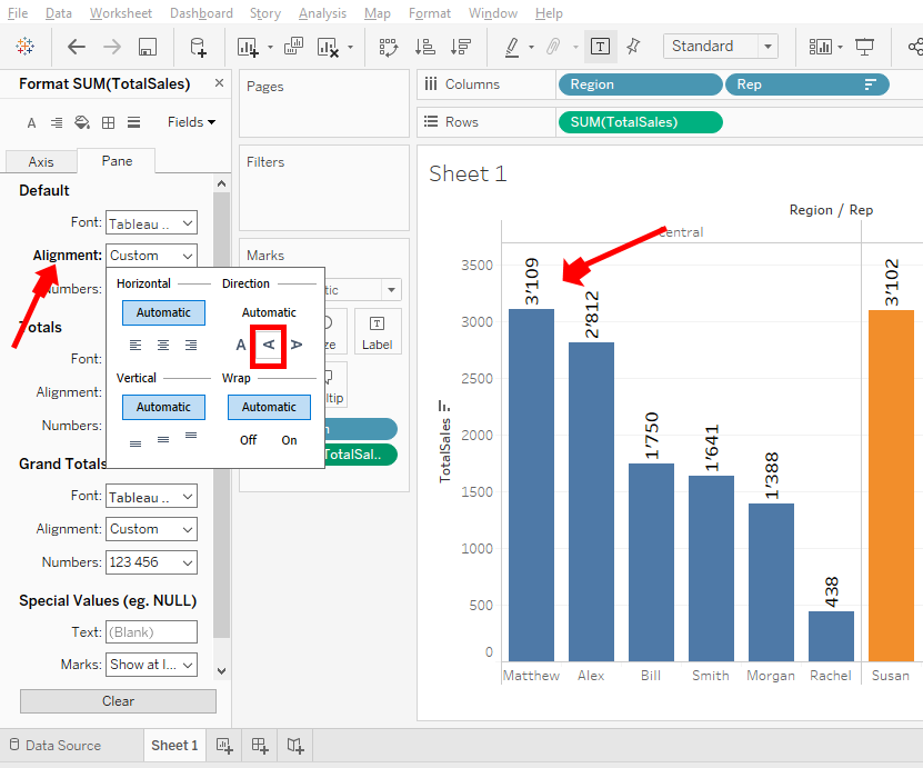
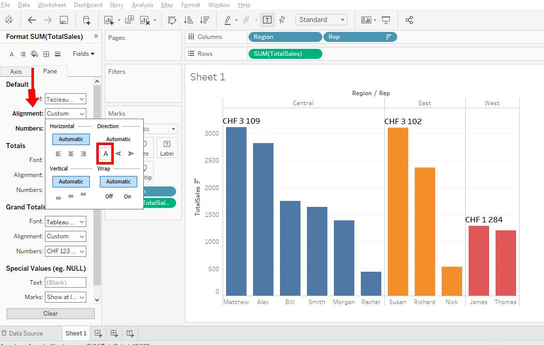
By clicking on « Alignement », you can change the text’s direction of the labels.
But what you can’t do with the « Labels » button is to change the digital type.
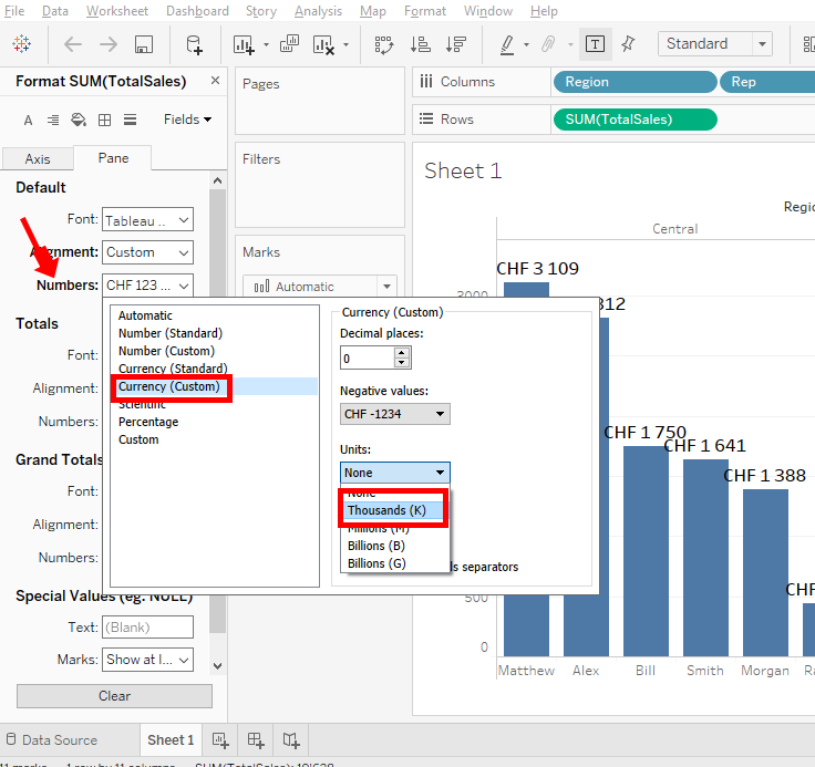
Return on the tab « Pane », we’ll change the numbers in currencies. Click « Numbers » and select « Currency(custom) ». You can also change the currency type in the « Prefix/suffix ».
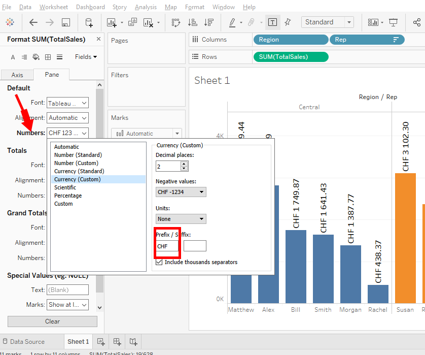
To simplify, you delete 2 decimals in « Decimal Places ».
As you can see on my bar chart, the SUM(TotalSales) is vertical at the top of each bar. To change the direction of the label text, click « Alignement » in the « Pane » tab.
But there is a problem. Some bars don’t have SUM(TotalSales). To fix this, right-click on each bar and select « Mark Label » and « Alwlays Show ».

Now, the bar chart is more understandable.
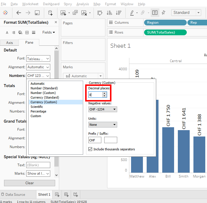
Let’s put the units in thousands. Click on « Numbers » => « Currency(custom) » => « Units » => « Thousands (K) ».
Add a decimal in « Decimal Places ».
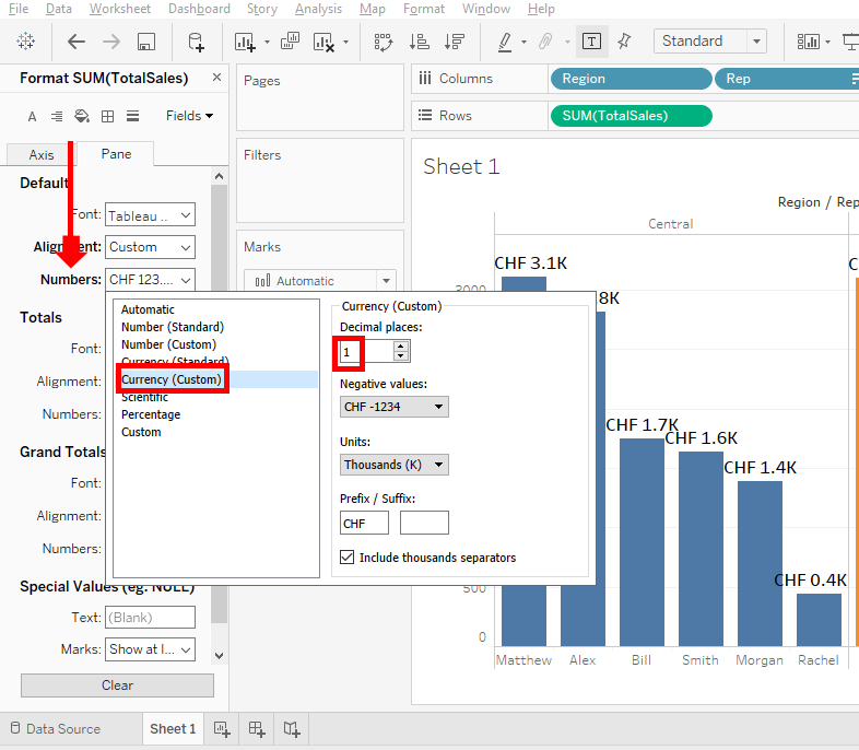
That’s better, we can see Swiss francs sales for each sales representative.
Look, there’s something you need to know You can’t change the size of the text in the tab « Pane ».
If you click on « Font » and change the size, it will not change anything on your bar chart.
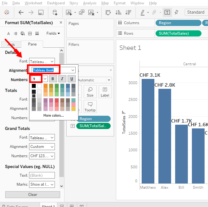
This is because the font size in the « Label » button dominates the font that is in the tab « Pane ».
Ok, we changed the labels format. Now, let’s change the axes format.
To do this, right-click on the vertical axis and select « Format ».
Click on the « Axis » tab and change the text size with « Font » to 12.

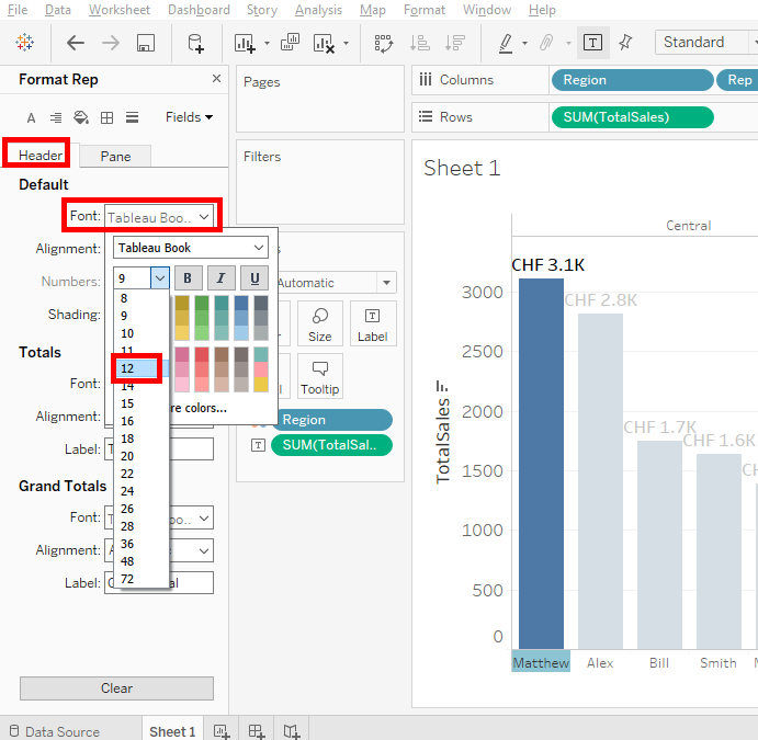
Then, right-click on the horizontal axis. Selects « Format ».
And in the « Header » tab, you change the text size with « Font » to 12.
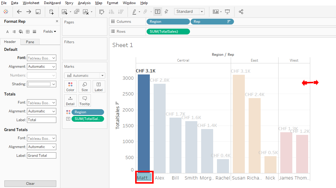
Oooh, do you see ? Mathiew is cut off. To arrange this, enlarge the bar chart by clicking and dragging on the right.
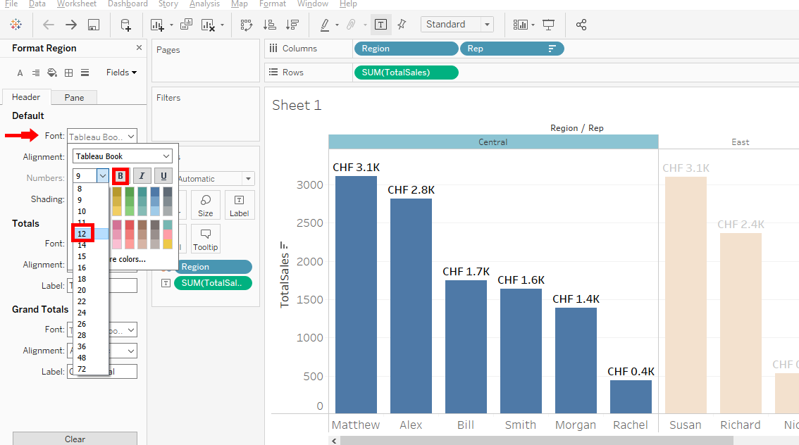
Right-click on « Central » in the top axis and select « Format ».
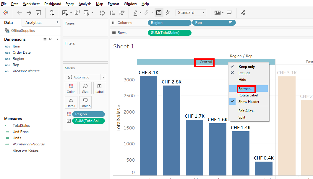
And changes the text’s size with « Font » to 12 and bold.
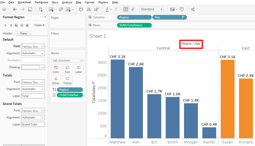
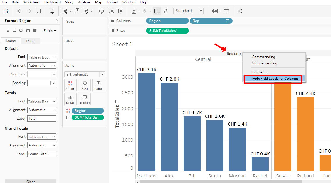
Now, look at the top of the bar chart. The « Region/Rep » line is useless because we know that Central, East and West are the regions and the representatives names are at the bottom of the bar chart.
To change it, right-click on « Region/Rep » and select « Hide Field Label for Columns ».
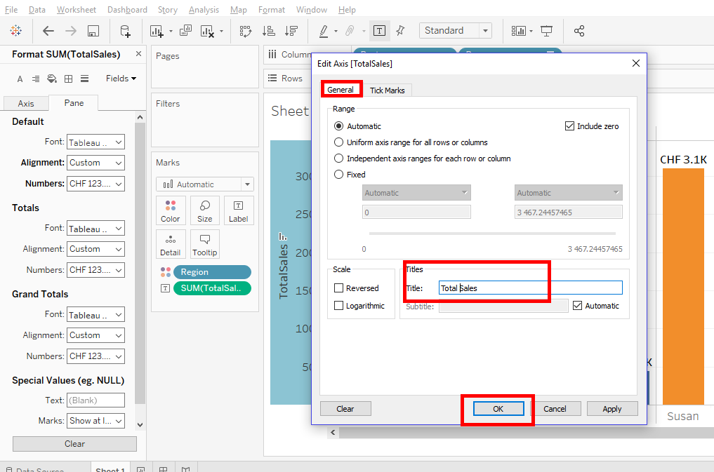
if you want to improve the title « TotalSales » by adding a space, right-click on the vertical axis and select « Edit axis ».
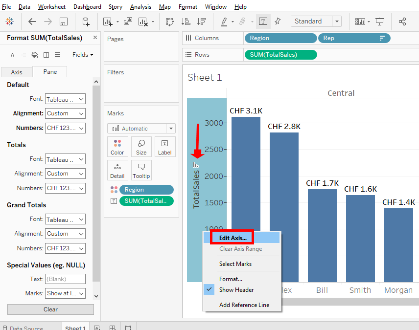
In the « General » tab, add a space in the title and click « OK ».
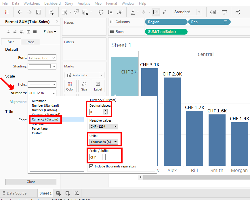
Let’s do one more thing. We’re going to put all the « Total Sales » in Swiss francs. Make a right-click on the vertical axis and select « Format ».

Click on tab « Axis » => « Numbers » => « Currency(custom) ».
In « Decimal Places », you put « 0 ». In « Units », you put « Thousand(K) ». In « Prefix/Suffix », you put « CHF ».
Well, you did a good job. Now you know how to change the format of the charts in Tableau.
Share this article if you think it can help someone you know. Thank you.
-Steph