

I have just enrolled in a Data Science course on Udemy and I learned good stuff.
How was the A/B test « Number Of Product » ? Easy or difficult ?
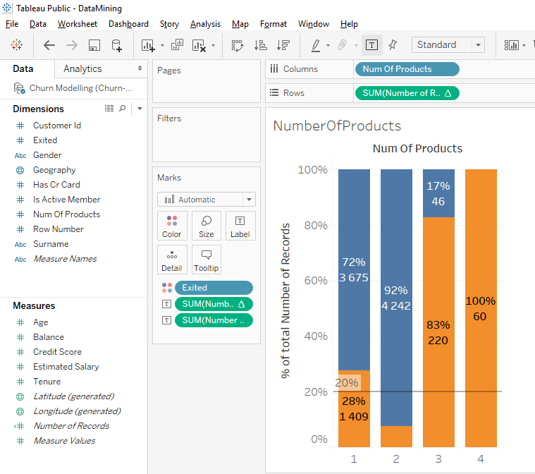
Here is the result I found.
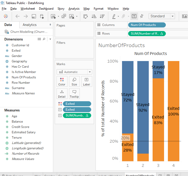
I think you noticed there was something bizarre. There is an anomaly. We imagine that the more the client has products, the more the client is satisfied with the bank so this type of clients should stay in the bank.
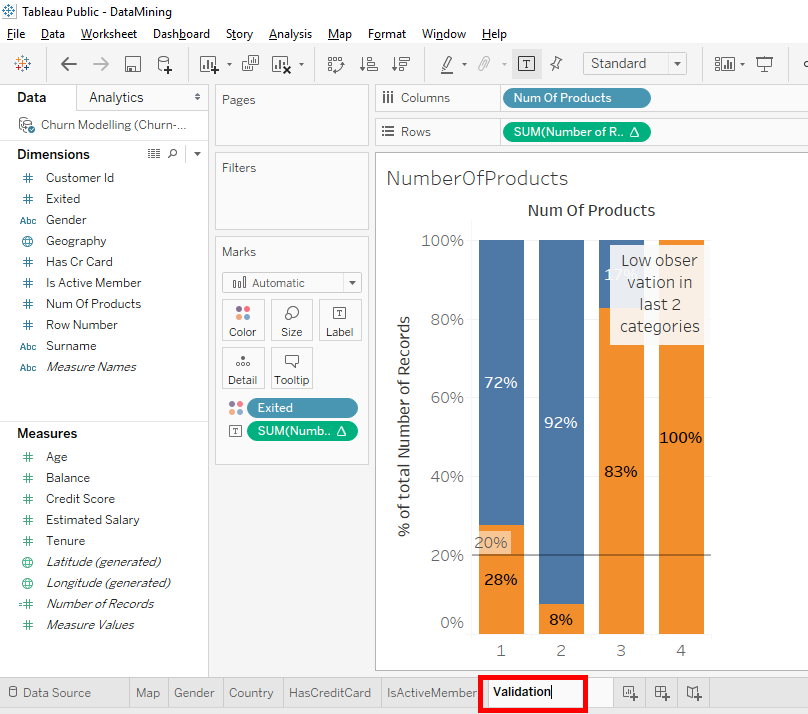
In the first 2 bars we can see that a client who has 1 product is more likely to leave the bank than a client who has 2 products. But when a client has 3 or 4 products, we see a huge rate of clients leaving the bank.
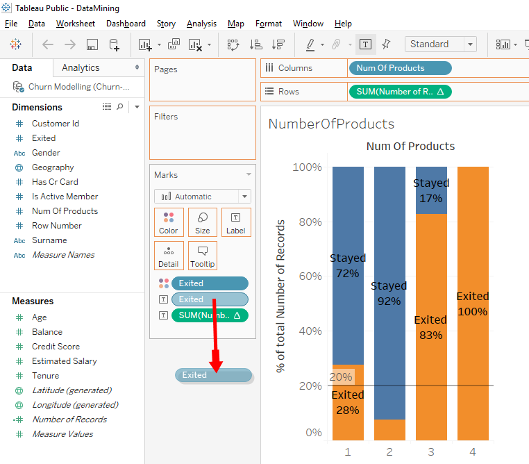
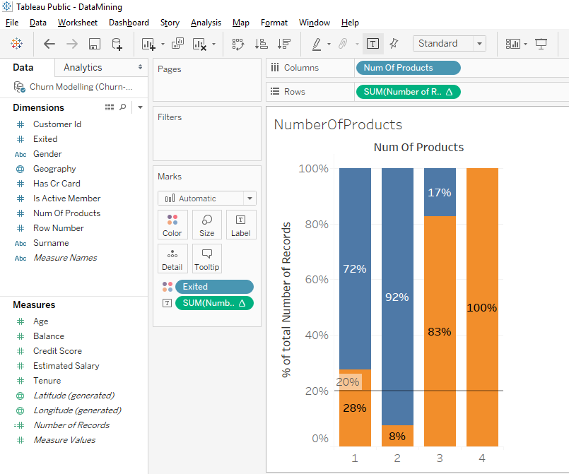
Look, there is a little bizarre detail. In the 2nd bar, we can’t see the « Exited » label. This is because there is no place in the orange part to put the text. To make it simpler, we’ll remove the label « Exited ». Drag and drop on the « Exited » text label to the outside.
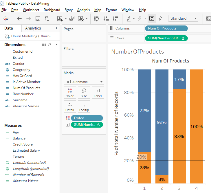
Perfect, we can read the percentages. On the 1st bar, we can see that among the client that have 1 products, 28% left the bank. On the 2nd bar, we can see that among clients who have 2 products, 8% left the bank. This show us that clients who have 1 products are more likely to leave the bank than clients with 2 products.
And for the next bars, we observe an anomaly. On the 3rd bar, we can see that among the clients who have 3 products, 83% left the bank. On the 4th bar, we can see that among clients who have 4 products, 100% left the bank. We clearly see that there is a problem and we need to do a deeper analysis to understand what is going on .
As a Data Scientist, we need to explain what happens in bars 3 and 4. Usually when a client has 3 or 4 banking products, that means he/she is satisfied and is loyal to the bank. But in our case, it’s the opposite because there is a high rate of client who left the bank. This is the time to do deeper analysis.
The first thing to analyze is the quality of the data. There is a very big anomaly and it may be because there is something insignificant in our data that disturbs the statistics. For example, it’s possible that when the bank selected these clients in this sample, there were very few clients with 4 products and all those clients with 4 products left the bank. Sometimes chance can create anomalies and you have to play attention to these effects of chance because they don’t seem important but they can create false interpretations.
To start, we will check the number of clients with 4 products.
In « Measure », move « Number Of Records » (which gives the number of observations) on « Label ».
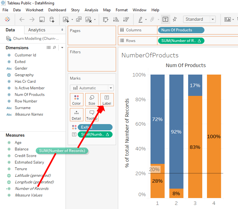
We observe on the first 2 bars than many clients with 1 or 2 products selected for our sample. For clients with 3 or 4 products, we can see that there were fewer clients selected for our sample.
There are 220 clients with 3 products and 60 clients with 4 products. These small number of clients probably explain why we observe these anomalies.
In this sample of randomly selected clients, there are very few clients with 4 products and they all left the bank. In this situation, we can confirm that it’s a chance. When thing like that happen, you have to be very careful not to make conclusion too fast and make misinterpretations.
The conclusion is that a lot of clients have been selected for category 1 and 2. For category 3 and 4, there have been few clients selected so we can’t do accurate statistics. We need to do deeper analyze for these categories of clients with 3 and 4 products.
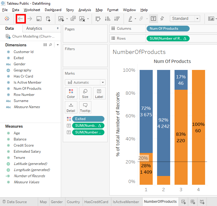
Now, let’s put the percentage back on the bar chart. Click on the « Back » button.
.
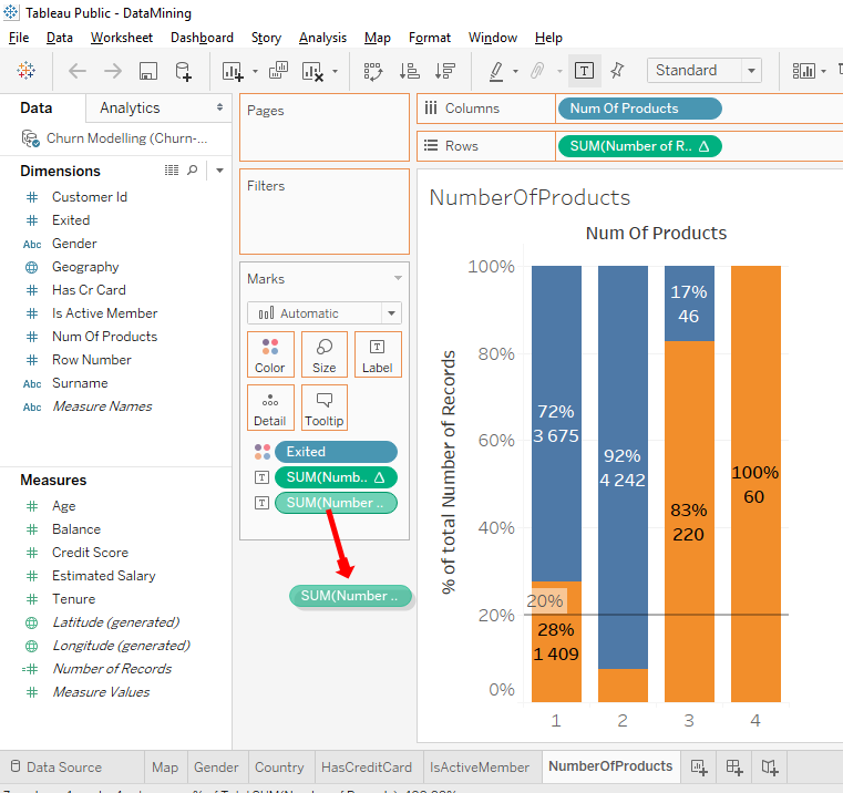
Or do a click and drag of « SUM(Number of Record) » to outside.
We saw that there is an anomaly and what is interesting to do is to have a comment to remember to do a more in-depth analysis of columns 3 and 4.
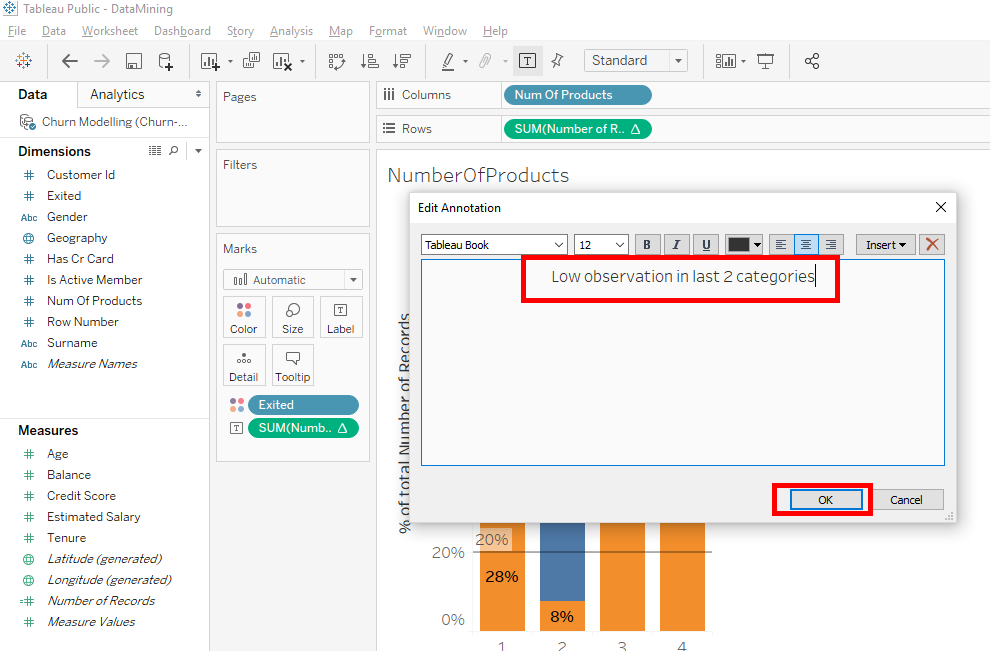
Right-click between the bar chart’s title and the bars. Select « Annotate » then « Areas… ».
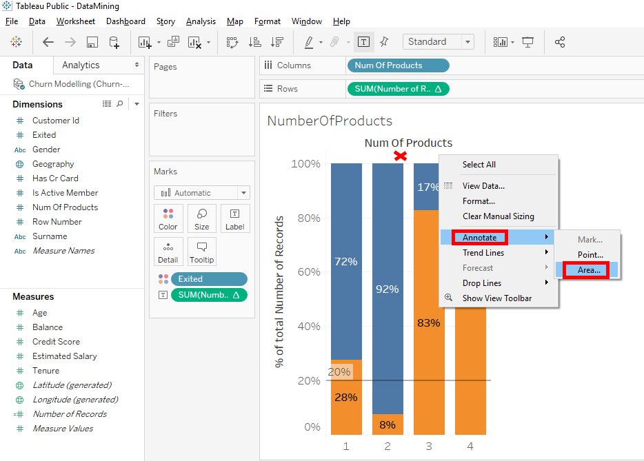
A window appears. In this window, you write « Low observation in last 2 categories » and click on the « OK » button.

Click on the comment and move it on bars 3 and 4.
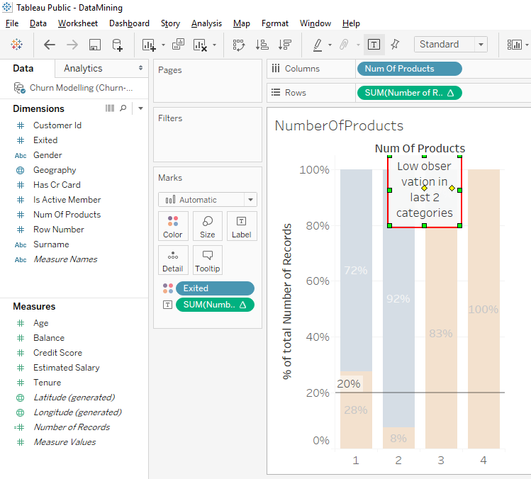

The next time you work on this bar chart, you will see this comment that will remind you to seriously analyze client who have 3 and 4 products.
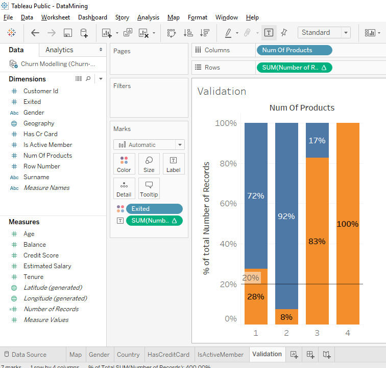
Validate our approach
It’s time to show you how to validate an approach and how to validate the data. For this we will create a new A/B test.
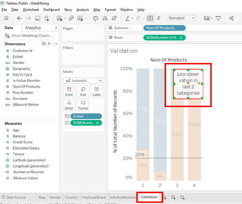
Duplicate this worksheet with a right-click on the « NumberOfProducts » tab and select « Duplicate ».
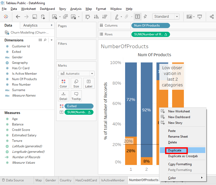
And rename the tab « Validation ».
For this tab, we will erase the comment. Select the comment and press the « Delete » button on your keyboard.
Everything is ready, the idea is to find a variable that doesn’t affect our results. That is a variable that has no impact on a client’s decision to leave or stay in the bank.
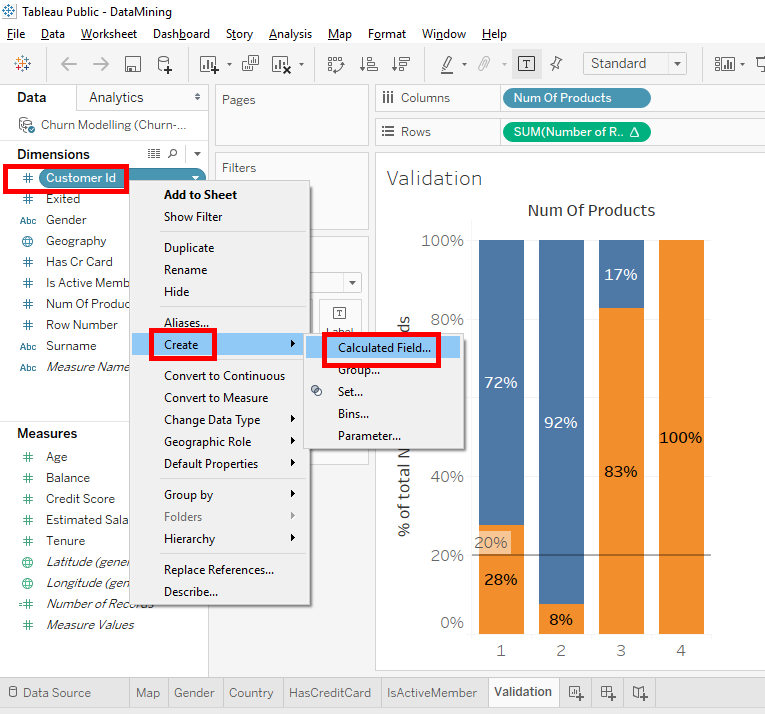
Take for example, the variable « Customer Id ». Client’s identification number has no influence on the client’s decision to stay or leave the bank.
We’ll do an A/B test with the last digit of the « Customer Id » and we’ill check that there is the same clients proportion who leave the bank in the 10 categories of the last digit of the « Customer Id ». The 10 categories are the numbers 0,1,2,3,4,5,6,7,8,9.
Let’s g.To start, we will create the variable that contains the last digit of the « Customer Id ». To have this variable, we will create a « Calculated Field ».
Right-click on « Customer Id », select « Create » and click on « Calculated Field ».

Name the calculated field « LastDigitOfCustID ». In the text field, we use the « RIGHT » function with « Customer Id » in parenthesis to select the last character of the « Customer Id ». In our case, the last character of the « Customer Id » is the last digit.
Here is the code to write in the text field : Right ({Customer Id},1)
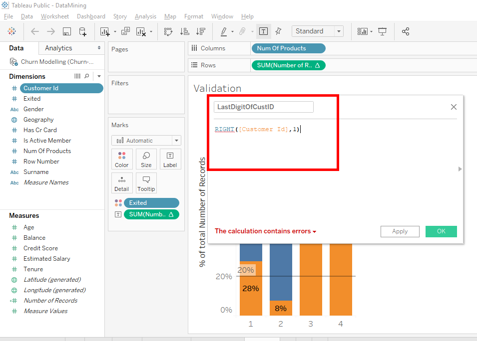
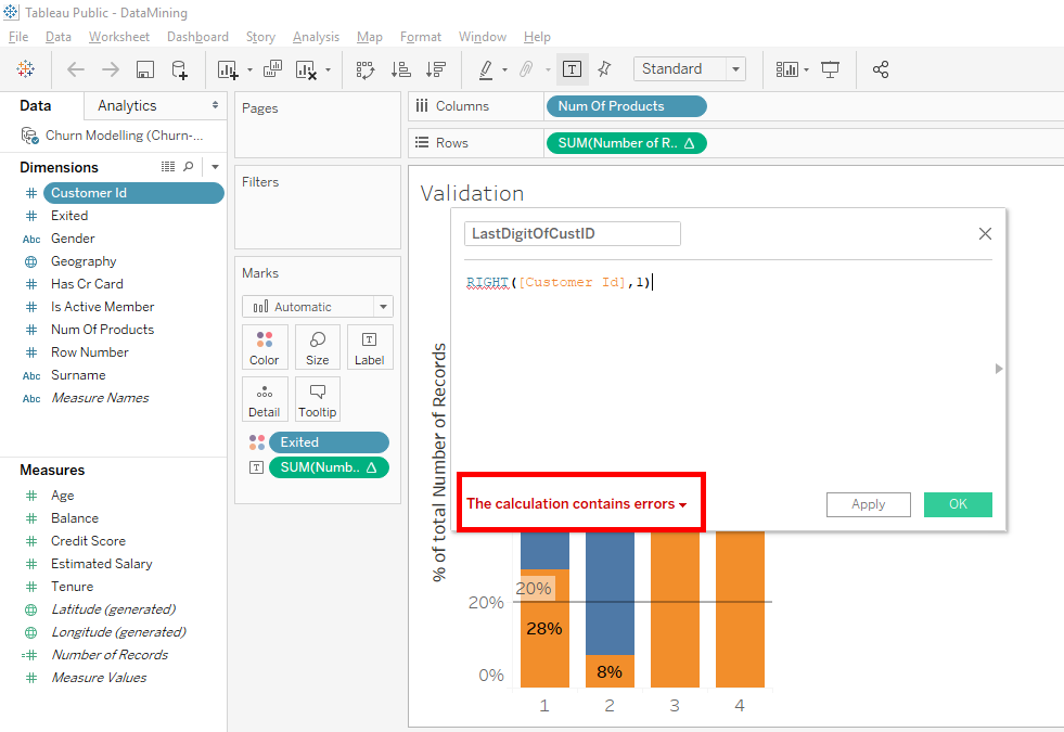
Oooops, you see there is a small mistake => The calculation contains errors.
There is an error in the formula because « Customer Id » is a number variable and the « RIGHT » function applies to a variable of type « STRING ».
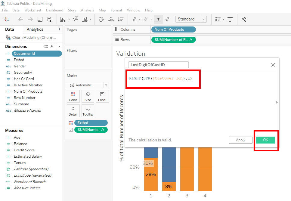
To use the « RIGHT » function, we will convert « Customer Id » into a string. We will use the « STR » function with « Customer Id » in parenthesis.
Here is the code to write in the text field
And click on the « OK » button : Right (STR({Customer Id}),1).
Now, you can see that our calculated field « LastDigitOfCustID » is in « Dimensions ».
Click on « LastDigitOfCustID » and move it on top of « NumOfProducts » in « Columns ».
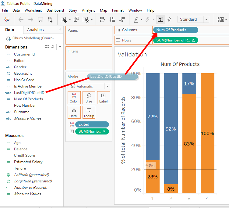
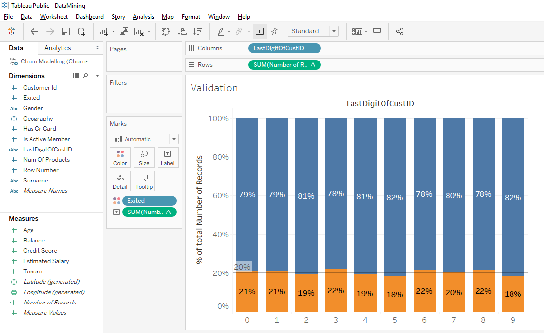
Now we have a new bar chart and we see that for every last digit of the « Customer Id » there is about the same proportion of clients leaving the bank. All these proportions don’t correspond exactly to the average of 20% but these slight variations aren’t important.
Seeing this uniform distribution allows us to validate our data because these data are homogenous.
Conculsion
Here’s how you can check the homogeneity of your data. You take a variable that has no impact on the fact that a client leaves or stays in the bank. The example we did with the last digit of the « Customer Id » is excellent. We were able to verify that in each of the categories taken by this variable, if there was the same proportion of clients leaving the bank. As is the case, we can validate our data.
Imagine another result. When we do the test with the last digit of the « Customer Id », we observe that for one of the numbers, the rate of clients who left is really higher than the average. This shows us that there is a problem in our data because it indicates an anomaly.
You can find other ways to verify your data by using other « insignificant variables » to see if the distribution is homogeneous. But be careful when you select an « insignificant variable » because there may be traps.
Here is an example. If you create a variable that takes the first letter of the first name, the distribution will not be homogeneous. The reason is simple, there are many more people who have a name that starts with the letter « M » than with the letter « Y ».
Share this article if you think it can help someone you know. Thank you.
-Steph